Contemporary specimen book inspired by the ‘Indie Fonts’ book series

Eris Alar
Posts: 459
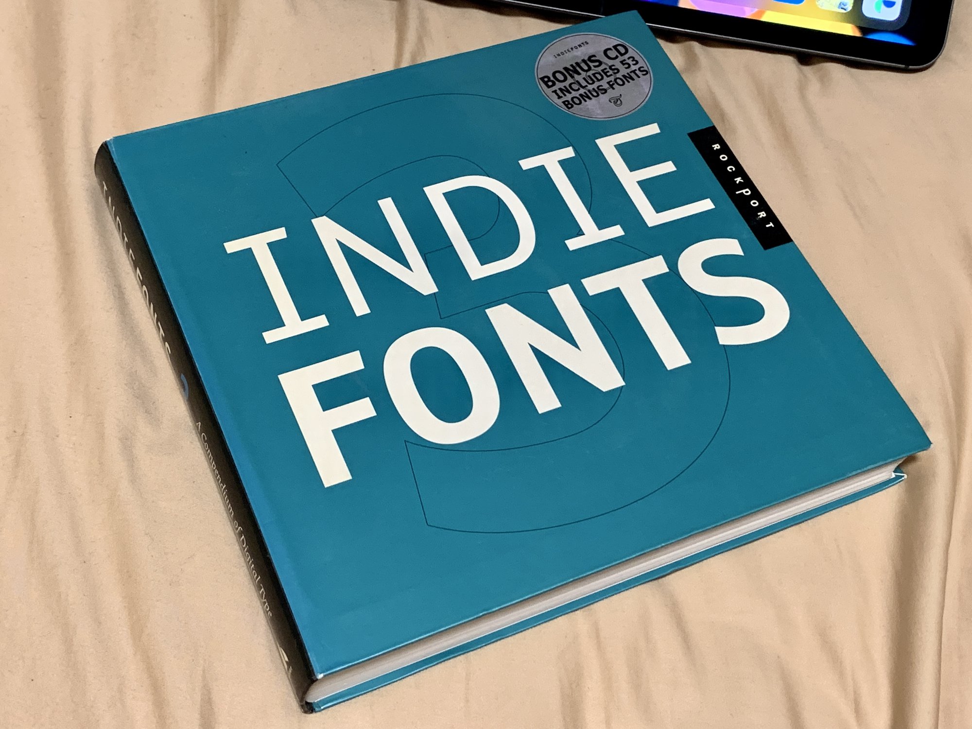
Indie Fonts 3 was the first type specimen book I ever bought, from the gift shop at the National Gallery of Victoria (state art gallery). I adored it then, and treasure it now, even though I have many more specimen books.
I am toying with an idea to try to produce something similar. I know the landscape has changed, so my thinking is to use Kickstarter or a similar crowd funding platform and aim to get enough backers for a print run. Retail sales would not be the primary goal, but obviously I’d be open to it.
For those of you who participated in the Indie Fonts series, did you find it a rewarding experience? Did they pay you, or did you consider it part of your marketing strategy and as such advertising?
1
Comments
-
There are the Yearbook[s] of Type by Slanted Publishers which are on a pay-and-your-fonts-get-in basis https://www.slanted.de/product/yearbook-of-type-2021-22/Not sure how much (more) demand there is for something like this with blogs, sites and newsletters now.5
-
Ooh! Thanks, I had no idea these existed.kupfers said:There are the Yearbook[s] of Type by Slanted Publishers which are on a pay-and-your-fonts-get-in basis https://www.slanted.de/product/yearbook-of-type-2021-22/Not sure how much (more) demand there is for something like this with blogs, sites and newsletters now.0 -
I think there have been four or five now? Maybe more known in Europe but I also don’t think they are super widely available. With little to no curation, I don’t find them especially useful but in 30 years they will make for nice time capsules.6
-
I just ordered the current one, as also picked up the two Robin Kinross books to browse :-)0
-
FWIW – the Indie Fonts specimen was also on a pay-to-get-featured basis. Participating foundries had to buy a minimum amount of copies from the publisher. At least for the first volume, don’t know about the other two.
4 -
interesting, I had no idea. Thanks0
-
I participated in Indie Fonts 2. You had to pay to get into it (I think it was $1800) and you got 16 pages to fill. You had to follow a template, supplied as Illustrator files. I didn't have many fonts on the market yet at the time (2002)—definitely not enough to fill 16 pages—, so I used it as an opportunity to expand my offerings, adding 35 new fonts by the time it was published in 2003.
In addition to getting 16 pages in the book, you also got 100 copies of the book which you could use however you liked. Some people sold them. I was selling fonts directly from my website at the time and gave them to customers who spent $100 or more. (I still have some left if anyone wants one.)
I think I got my money's worth from participating. It helped jumpstart my font business. I don't know if it would have the same effect in today's market, though.
I got the impression from Rich Kegler, who published it, at the time Indie Fonts 2 came out that it was a big headache to produce. But then, he did a volume 3.8 -
I participated as well and ended up with a boatload of copies to basically give away. Nevertheless, it paid off for me, as well. Today, demand for print products is small but print-on-demand offers a cost-efficient alternative and high-cap thumb drives are downright cheap.I'd take Rick at his word—do the project for love rather than money.4
-
Re. the pay-to-get-featured practice: In the newspaper world, masking advertising as editorials is considered unethical. I’ve stopped reading most designer blogs and books/magazines, as I can’t trust their opinions and claims to be honest. I also worry about the long-term repercussion of not having a critical design press: power abuse is allowed to go unexamined, actual valid claims and critiques are not separated from PR leading to lack of respect from clients, those without means to pay are excluded, etc. (edited the text slightly)
2 -
I can't speak for Rich, but in the case of the Indie Fonts books, they were definitely promotional in nature. The participants were all relatively unknown at the time and most of us saw it as a kind of partnership to help one another to get some attention. The fees we paid were used to partly offset the expense of getting it printed. I don't think the book made any pretense to be some kind of objective critical survey and I don't think Rich made a lot of money from it.6
-
Given the landscape today, if I pursued this I’d treat is more as an art book, documenting things, so, pay contributors, have some sort of focus to the book etc. it’s selfish, as I just love seeing traditional-style printed type specimens :-)2
-
At least one reader above never knew that this was a promo piece. I know all too well that the font business is a constant hustle for attention, and I understand why one might tag on to stuff like this, deep discounts, etc. In journalism, these standards exist because what they publish is important. IMO, the implicit message of hollow design promo/press is that what we do doesn’t really matter much.
0 -
When has any design journalist ever said “not their best work”?
Design writing is all puffery—publishers are not going to diss potential advertisers and readers want to hear what’s hot. And designers do so much self-promotion, given their easy access to creative tools.
While I too would like to see more independent design journalism, the Indie Fonts are not magazines but books that have little editorial text, barring the blurb at the front extolling the virtues of indie type design in general.
The Indie Fonts format is not too different from a curated content book such as Jan Middendorp’s Type Navigator—i.e. it is mostly good old-fashioned type specimens, presented in a format that is consistent throughout the book, which does enable a large measure of objective, hype-free appraisal. I might add that the “editorial” texts in Type Navigator were provided by the foundries.
The Slanted Yearbooks followed the Indie Fonts format—with foundries paying for a number of pages, some to a page layout design common with other participants, and some which are foundry-created pages that are promotional.
I’ve participated in Type Navigator (providing the publisher with fonts) and both Indie Fonts and Slanted Yearbooks. They is what they is.
I still have a box of Indie Fonts 3—each volume with a CD!
I was relying on Mark to do the heavy-lifting distribution.4 -
I did not know they were promo, in one sense, as I was unaware of how most business like this works at the time, but on the other hand I knew they were promo as they were actively promoting different foundries. I used them as a way to find and license from different ones. So I was aware they were marketing, I was just unaware of the mechanics for how they were produced.notdef said:At least one reader above never knew that this was a promo piece. I know all too well that the font business is a constant hustle for attention, and I understand why one might tag on to stuff like this, deep discounts, etc. In journalism, these standards exist because what they publish is important. IMO, the implicit message of hollow design promo/press is that what we do doesn’t really matter much.
I think the value of printed specimens, especially these days, if having something tangible for the historical record. yes, few people will really appreciate them, but to me that does not matter if they are art history artefacts. I know I love looking through my 1958 second edition of The Encyclopaedia of Typefaces, for example. Indie Fonts fits this space for me too, a time capsule of that era.1 -
Here's a complete take-all-the-ignorance-outta-you hardcover print-on-demand service.Burn your own CDs/DVDs...
0 -
Here's a complete take-all-the-ignorance-outta-you hardcover print-on-demand service.I wonder if we’ll ever have print-on-demand books compiled as signatures and stitched rather than glue bindings?
1 -
I'm awaiting the option for luxe editions on vellum!0
-
@John HudsonI wonder if we’ll ever have print-on-demand books compiled as signatures and stitched rather than glue bindings?If they got the equipment, it can be done. Back in the day, when I was working in a print shop which had the equipment, many wonders could be performed with Quite Imposing software and PDFs.I'm awaiting the option for luxe editions on vellum!If it can be sheeted, it can be printed.
0 -
@kupfers my copy of the 2021/2022 Slanted specimen book just arrived. It looks nice, but the bright colours and form factor make it hard for me to evaluate the type ha, I think I'm just use to books from the 1950s that are larger sheet size and mostly black ink. It has helped me think about what I would want in my book, for example in this one given it is so big I've taken to using post-it notes to mark pages I want to return to, having some ribbons like in FontBook would have been nice (but I assume expensive too!).

1 -
Re POD, Blurb is high quality, now offering some Mohawk papers: https://www.blurb.com/photo-books
I've used Blurb and MagCloud a couple of times for images and found them good, I will pursue POD for my book (if I make it!) as it will be more of a passion project than lucrative retail hit I imagine.
My current idea is to approach a couple of foundries I have a good relationship with and work with them on books of just their catalogue. That way I can test the waters, they get a decent specimen book and we all can learn in the process. But I'm not setting any timeframe for this, it will just be something I do as I have headspace and capacity.0


Categories
- All Categories
- 46 Introductions
- 3.9K Typeface Design
- 489 Type Design Critiques
- 572 Type Design Software
- 1.1K Type Design Technique & Theory
- 659 Type Business
- 874 Font Technology
- 29 Punchcutting
- 528 Typography
- 121 Type Education
- 327 Type History
- 80 Type Resources
- 111 Lettering and Calligraphy
- 32 Lettering Critiques
- 79 Lettering Technique & Theory
- 560 Announcements
- 95 Events
- 116 Job Postings
- 169 Type Releases
- 179 Miscellaneous News
- 269 About TypeDrawers
- 53 TypeDrawers Announcements
- 114 Suggestions and Bug Reports