Florin sign (ƒ)

Ermin Međedović
Posts: 98
A gulden or guilder
Is it still necessary?
Is it still necessary?
0
Comments
-
It's certainly necessary for typesetting documents that refer to the period before the euro, and for displaying historical documents. Technically, it is necessary to be able to accurately claim support for 8-bit codepages that include that character.
[In most fonts I make these days, this character gets included as a hooked f, rather than a florin sign per se, since I'm supporting an extended Latin character set. Unicode, probably unwisely, unified the lowercase hooked f character with the existing florin character.]2 -
Dutch Caribbean colonies?0
-
Dutch Caribbean colonies?
They use abbreviations, not ƒ.0 -
Abbreviations for what?, and who is " they" ?0
-
They would be the people who live in the Dutch Caribbean colonies whose currencies are supposedly represented by ƒ. But when I’ve been to the Caribbean, I’ve never seen a typeset ƒ. For example, in Aruba a price would be WSG 9.99 rather than ƒ9.99. Although sometimes people will write an ƒ rather than use the abbreviation.
And it’s also worth noting that prices on those islands are usually in US dollars anyway, as that’s what most of the tourist economy deals in.0 -
The Dutch still use the florin symbol ƒ as a currency symbol in documents mentioning money before the introduction of the euro.
In Togo, the same character is used as a letter Ƒ/ƒ in the orthography of the Ewe language. If you plan to support that language the glyph must be a proper letter (proper ascender and descender, upright in upright, distinguishable from f in italic, etc.). What’s interesting is when one tries to support both cases, the letter and the currency symbol, what do you leave as the main glyph, how do you access the other(s)?4 -
By the way the font displaying ƒ right now does something really odd. The glyph is upright as the letter, but has the dimensions of a currency symbol matching figures. So it's totally unusable in Ewe, but must be in italic to be used as the florin symbol: ƒ5.1
-
Thanks everybody, it is as I thought, I don't need florin.fitted, florin.smcp, florin.sups and florin.sinf anymore. One florin is enough.
So I have a "big five" (dollar, yen, euro, cent and sterling) .fitted, .smcp, .sups, and .sinf and the rest of currency symbols just plain; peseta, franc, lira, naira, rupee, won, mill, colonising, cuzeiro, dong, shekel (or sheqel), kip, tugrik and peso.
Did I miss something useful?0 -
What are superior and inferior currency symbols used for?0
-
Good question, I'm not sure from when I have those in my .enc files. With numbers and basic mathematical symbols (plus, minus, equal, multiply, divide and slash. And period and comma).
Do you think nobody use them?
I believe I have to rethink my .enc files.0 -
Apart from the historical use, many people use ƒ as an abbreviation for "Folder" in the Mac Finder. Didn’t we have that discussion already last year?
BTW there is no such thing as Dutch colonies anymore. The political status of the six Dutch Caribbean islands has changed significantly, ahem. Three of them, Saba, Sint Eustatius and Bonaire, a.k.a. the Caribbean Netherlands, are municipalities of the Netherlands. Even though they are part of the Netherlands, they use the US dollar as currency.
The other three, Aruba, Curaçao, and the Dutch half of Sint Maarten, are separate countries with their own prime minister and government and all, alongside the Netherlands in the Kingdom of the Netherlands, i.e., these four countries have the same king. Aruba uses the Aruban florin, Curaçao and Sint Maarten use the Netherlands Antilles Florin, for which ƒ can be used, I believe. (Rather handwritten than typeset because people usually do not know how to type it on Windows, duh.)4 -
According to this Wikipedia page, for the Aruban florin, ƒ is not being used. According to this Wikipedia page, the Netherlands Antillean guilder will be replaced in 2013 by the Caribbean guilder, for which ƒ can be used.0
-
Apart from the historical use, many people use ƒ as an abbreviation for "Folder" in the Mac Finder.
I think that the market for people who buy fonts to replace the Mac OS system fonts is even smaller than the market for people who need ƒ in display fonts.Good question, I'm not sure from when I have those in my .enc files.
Did you get them from someone else? I don’t even see superscript currency in the character sets for the really huge fonts from Vllg or Terminal Design. Basic superscript math characters make sense for a some text fonts because they’re useful for chemical symbols and simple equations that appear in textbooks and scientific journals.0 -
It seems the abbreviation for Caribbean guilder will be CMg. That’s the only one mentionned on the FAQ page of the central bank. There was an interesting post about a new currency symbol at Underware.0
-
Did you get them from someone else?
Well, I did. Some of .enc files I've got from Nikola Djurek. I add some glyphs, and now, I have a table with about 1200+ glyphs. Without a ding + orn part.0 -
What are superior and inferior currency symbols used for?
Within some display styles, superior currency forms *might* make sense for certain kinds of advertising use, like weekly sales circulars. I don’t know if this is a peculiarly American style (thus limiting the need to dollar and cent) or not.
But no, these are not generally useful.
0 -
 6
6 -
Target (department stores) uses superior dollar signs and figures on their circulars. They have special custom fonts with superiors and other custom characters that they use internally. I’ve helped them a bit in the past on the technical end with these fonts.1
-
Is "freshness" a registered OT feature?1
-
Yes, David, it is right up there after "Refresh the Brand" :-)0
-
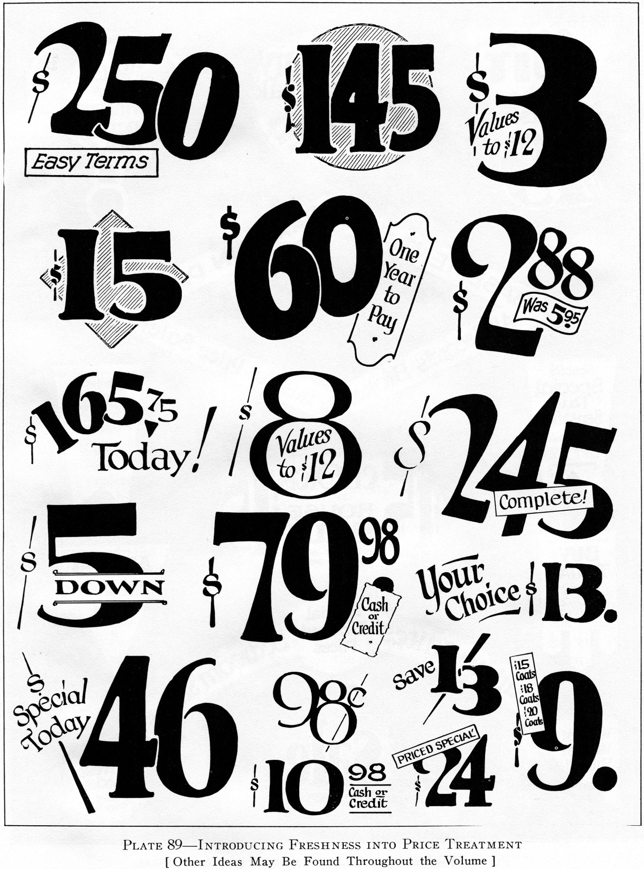
BTW, the image above is from 1928 "1000 Practical Show Card Layouts" by H. C. Martin.
If you like that kind of stuff, you may also like the stuff from Samuel Welo's books.2 -
Just got a GoPro and have been reading a bit about photography.
The florin sign is used a lot in photography when writing about aperture range.
Since nobody have mentioned this use yet, I though about adding a quick note here.
Today I've also spotted it again in the iphone7 page when they brag about they camera.
1 -
But that is called an "f stop" and is usually just an italic f.5
-
Although f-stop can be correctly indicated with just an italic f, the fact of the matter is that very frequently in the digital age the florin/hooked-f ƒ is now used. Pretty much ever since the Mac keyboard made it convenient with option-f, I think.
5 -
Since I am a TeX user, the symbol for the f stop is most easily obtained with $f$ which is
<p>1D453 MATHEMATICAL ITALIC SMALL F</p><p></p>
and looks like this in the Unicode charts

but maybe \textit{f} (in LaTeX) or {\it f} (in plain TeX) would be more appropriate... Who knows?
1 -
The florin is still far more necessary than dozens of characters type designers tend to include in their fonts...2
-
Historically, what would the florin sign look like if the Unicode comittee hadn't unified it with the hooked f ?
Is a hooked f any different from a traditional florin symbol ?
0 -
I would consider use of the florin for f-stop to be a hack. It's just an italic f, but the italic f in most fonts doesn't look the way people thought it should for this particular use. Instead of switching to a different font for the f, people discovered there was already a character that happened to look like that in most fonts, the florin. It's a case of choosing appearance over semantics.6
-
examples of florin variant glyphs after historic manuscripts:Paul Miller said:Historically, what would the florin sign look like if the Unicode comittee hadn't unified it with the hooked f ?
11 -
If it is admitted that the f stop is an italic f, what is the problem in considering that the florin is the italic hooked f and that the hooked f in the upright font is to be upright?0


Categories
- All Categories
- 46 Introductions
- 3.9K Typeface Design
- 489 Type Design Critiques
- 572 Type Design Software
- 1.1K Type Design Technique & Theory
- 664 Type Business
- 877 Font Technology
- 29 Punchcutting
- 530 Typography
- 121 Type Education
- 328 Type History
- 81 Type Resources
- 111 Lettering and Calligraphy
- 32 Lettering Critiques
- 79 Lettering Technique & Theory
- 562 Announcements
- 97 Events
- 116 Job Postings
- 169 Type Releases
- 179 Miscellaneous News
- 269 About TypeDrawers
- 53 TypeDrawers Announcements
- 114 Suggestions and Bug Reports