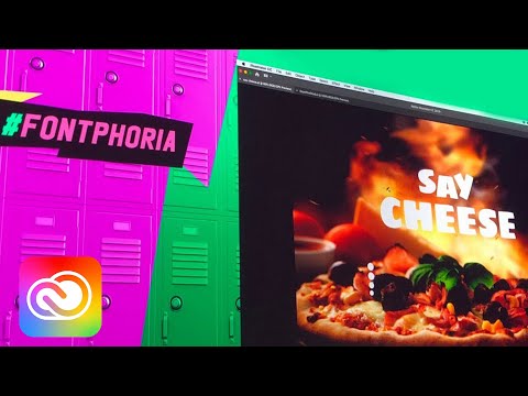
A Spectre Haunts Photoshop: Adobe Fontphoria

Dave Crossland
Posts: 1,554
Just some personal opinion, not the views of my employer or anyone else I may be associated with:
Adobe Max has a series of "woo" lightning talks called Sneak Peaks that demo what their r&d folks can do with machine learning to make design jobs... what a capitalist might call... "more productive," and there's naturally a font one.
No actual wooing, like in 2015, but it's very impressive. Congratulations to the folks who worked on it!
 https://youtu.be/eTK7bmTM7mU
youtu.be/eTK7bmTM7mU
It looks like it's mainly "style transfer" a la pix2pix: you draw 1 glyph - in color, as a bitmap, or as a vector - and can be extrapolated into a whole typeface, by using auto trace, auto space, auto kern, auto build, auto install stuff. The final demo even throws in some Augmented Reality live video image replacement code to do it all in apparent real time for good measure.
The first demo, where a sans serif font, presumably owned by Adobe, is converted to vector outlines on the artboard, has holes punched in one glyph like Swiss cheese, and then can be drag and dropped back onto the text element to reapply the hole punching via style transfer to the text element, where arbitrary new text can be typed with the derivative typeface, poses a kind of trolley problem for font licensing. I wonder how the OFL will play out there, since derivatives must remain OFL.
The second demo, where a phone camera snap of one of those ubiquitous and iconic sign painted trucks of India, is Fontphorified into a working font just fast enough you can see glyph being generated, will surely be instantaneous soon enough. I guess even today if one used the technology used to make Xbox games work on your phone. But I guess in the USA where letterform designs are completely public domain, there's no licensing issue at all with that.
I wonder how good the results are when you point your Fontphoria iPad at the American Type Founders specimen books.
And what this would look like as a font format. My guess is that this will not be forming the basis of a CFF3 proposal any time soon, though.
I didn't look too closely but I believe Adobe isn't actually announcing these Sneak Peaks as features shipping in Creative Cloud next month. It's more a hint of what can be done with state of the art computer graphics software engineering. I suspect a lot of it is what a savvy developer can do in a few weeks with the right idea and the libre licensed machine learning stuff lying around GitHub.
As they say, the future is already here, it just isn't evenly distributed yet.
After posting this I perused the Twitter hashtag feed #fontphoria - interesting reading... Some tweets touch upon the productivity ("saving time") and it turns out the research code was already posted on Github under a libre license")
Interesting times!
Adobe Max has a series of "woo" lightning talks called Sneak Peaks that demo what their r&d folks can do with machine learning to make design jobs... what a capitalist might call... "more productive," and there's naturally a font one.
No actual wooing, like in 2015, but it's very impressive. Congratulations to the folks who worked on it!
https://youtu.be/eTK7bmTM7mUyoutu.be/eTK7bmTM7mU
The first demo, where a sans serif font, presumably owned by Adobe, is converted to vector outlines on the artboard, has holes punched in one glyph like Swiss cheese, and then can be drag and dropped back onto the text element to reapply the hole punching via style transfer to the text element, where arbitrary new text can be typed with the derivative typeface, poses a kind of trolley problem for font licensing. I wonder how the OFL will play out there, since derivatives must remain OFL.
The second demo, where a phone camera snap of one of those ubiquitous and iconic sign painted trucks of India, is Fontphorified into a working font just fast enough you can see glyph being generated, will surely be instantaneous soon enough. I guess even today if one used the technology used to make Xbox games work on your phone. But I guess in the USA where letterform designs are completely public domain, there's no licensing issue at all with that.
I wonder how good the results are when you point your Fontphoria iPad at the American Type Founders specimen books.
And what this would look like as a font format. My guess is that this will not be forming the basis of a CFF3 proposal any time soon, though.
I didn't look too closely but I believe Adobe isn't actually announcing these Sneak Peaks as features shipping in Creative Cloud next month. It's more a hint of what can be done with state of the art computer graphics software engineering. I suspect a lot of it is what a savvy developer can do in a few weeks with the right idea and the libre licensed machine learning stuff lying around GitHub.
As they say, the future is already here, it just isn't evenly distributed yet.
After posting this I perused the Twitter hashtag feed #fontphoria - interesting reading... Some tweets touch upon the productivity ("saving time") and it turns out the research code was already posted on Github under a libre license
Interesting times!
1
Comments
-
This is going to take a lot of income away from type designers who get paid to turn one sketch into a typeface for an ad campaign.1
-
Is this working for lowercase as well, or is it uppercase only? The instructions on GitHub mention a data file “Capitals64”. My guess is that it is no coincidence we have not seen lowercase samples. Naturally, lowercase is less systematic (or, with a more complex system), and less consistent across typefaces than uppercase, so probably more difficult for the machine to learn.
3 -
This kind of tool could be useful for type designers even if it cannot design a whole font based on a small handful of letters.Still, there are certain rather dumb tasks we do a lot of the time: creating – or transferring changes to – other glyphs in the font, which should be possible to automate.For example, if you have the n and the k you practically have all the information you need for the h. Or, one could say, “I just changed the serifs on my D so, computer, please update the B and E as well.” A bit what we can do with components but more flexible and hassle-free.3
-
This thread, circa 1975: A spectre is haunting font design — the spectre of beziers!
2 -

The AI even introduces random typos to make the results look more human. Or did somebody mess up the mock-up?
1 -
My guess is that it is no coincidence we have not seen lowercase samples.Speaking from experience: if you've only seen a demo involving uppercase sans serif letters, what you've watched is basically a conjuring trick.3
-
In case you missed it amidst all the rest of the info in Dave’s main post, there is a paper and Github source code:
paper: https://arxiv.org/abs/1712.00516
code: https://github.com/azadis/MC-GAN https://youtu.be/eTK7bmTM7mU
0 -
Raster output. Could a GAN be trained with vectors? Pardon my ignorance.0
-
Our method takes a few example images as an input stack and predicts coarse shape and fine ornamentations for the remaining glyphs.
What's most striking in the numerous illustrations in the paper showing the results alongside the original designs — the 'Ground Truth' — is just how bad that prediction is. While the process is able to make proportional adjustments, it appears to have only one idea of structure. The use of colour fonts seems to me a red-herring, because one can easily be distracted by the fact that the process gets the colours in roughly the right places, whereas if one were looking at all these shapes as black glyphs, it would be more evident that this is so far just a way to make 90s grunge fonts.1 -
Yes. So far.
I think it is easy to either/both overestimate the near-term impact of this (yes, probably pretty darn low), or underestimate how much machine learning approaches to type design and generalizing from a handful of inputs might improve (in three, eight, or twenty years).1 -
The question this poses is whether or not taste (in creators as well as consumers) then adapts to revere those design solutions which are not easy to achieve via this artificial method.
4 -
@Johannes Neumeier: well, that and ten zillion cheap fonts produced this way, diluting the overall quality of fonts – and thus skewing the audience perception of what a good font looks like.0
-
I am reserving my professional scepticism. A similar hype from the past was using deep learning to contextually merge photos, remember that? The actual results, however, did not hold water. I merged a forest and a woman and got a mess instead of a dryad.
3 -
We solved that pretty efficiently in Fontark, with a smart grid on which the user can define any in-glyph connectivity and adjust in real time the correlated glyph parts at any chosen number of glyphs. This completely eliminates copy-pasting of the workflow.TimAhrens said:
Still, there are certain rather dumb tasks we do a lot of the time: creating – or transferring changes to – other glyphs in the font, which should be possible to automate.For example, if you have the n and the k you practically have all the information you need for the h. Or, one could say, “I just changed the serifs on my D so, computer, please update the B and E as well.” A bit what we can do with components but more flexible and hassle-free.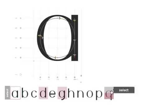 https://youtu.be/NsfbLjNF6zk
0


Categories
- All Categories
- 47 Introductions
- 4K Typeface Design
- 493 Type Design Critiques
- 575 Type Design Software
- 1.1K Type Design Technique & Theory
- 668 Type Business
- 883 Font Technology
- 29 Punchcutting
- 537 Typography
- 124 Type Education
- 332 Type History
- 81 Type Resources
- 112 Lettering and Calligraphy
- 32 Lettering Critiques
- 80 Lettering Technique & Theory
- 567 Announcements
- 99 Events
- 116 Job Postings
- 170 Type Releases
- 181 Miscellaneous News
- 270 About TypeDrawers
- 54 TypeDrawers Announcements
- 114 Suggestions and Bug Reports