'A typeface a day' week.

Ofir Shavit
Posts: 404
Next week, from 1 to 5th April I'm going to demonstrate Fontark in a special week long fest, in which I'm going to design and create a brand new typeface each day.
Starting on Sunday April 1st (not a joke!") ) with my first coffee of the day (which is normally at noon), I'll start with some sketches and brainstorming to set the direction to the font of the day, than igniting Fontark and start the build up. The mid section of the work will be dedicated to development and refinement of the design, then producing 2-3 weights and moving to the cleanups and final production steps that will include a ready to market package. Plus launching it of course.
) with my first coffee of the day (which is normally at noon), I'll start with some sketches and brainstorming to set the direction to the font of the day, than igniting Fontark and start the build up. The mid section of the work will be dedicated to development and refinement of the design, then producing 2-3 weights and moving to the cleanups and final production steps that will include a ready to market package. Plus launching it of course.
By the end of the week, I plan to have 5 brand new typefaces of 2-3 weights each, most of them will probably be Hebrew typefaces, probably experimental and fun, but I may decide making few Latin ones as well, depending on the day's inspiration.
The main purpose of this week is really to demonstrate the easiness and joy of work with Fontark and it's multiple glyphs editing system, and it's direct influence on creativity. Obviously, type design is not about speed, but, I truly believe that when things goes faster and easier, creativity rises too.
I will also try to broadcast my desktop live during my work so anyone could jump in and watch it happens, bug me with questions or design suggestions.
I'll post here the links to the "streaming channel" when it starts.
Starting on Sunday April 1st (not a joke!
By the end of the week, I plan to have 5 brand new typefaces of 2-3 weights each, most of them will probably be Hebrew typefaces, probably experimental and fun, but I may decide making few Latin ones as well, depending on the day's inspiration.
The main purpose of this week is really to demonstrate the easiness and joy of work with Fontark and it's multiple glyphs editing system, and it's direct influence on creativity. Obviously, type design is not about speed, but, I truly believe that when things goes faster and easier, creativity rises too.
I will also try to broadcast my desktop live during my work so anyone could jump in and watch it happens, bug me with questions or design suggestions.
I'll post here the links to the "streaming channel" when it starts.
0
Comments
-
All is set. I'll start streaming in few hours...
I'll create a streaming link for each day for the next 5 days, and post them here. Watching the stream is anonymous. I have no way to know who's watching and when. You don't even need to install or log-in or anything besides clicking the link.
If anyone will like to introduce himself, this will be nice, and can be done by the chat function. If you'd like to actually speak to me, you can contact me on Skype to...
user: fontark
I'll be glad to talk and explain what I do and how.
I will not be working all day long, I like to work in intervals. So check the stream every now and then to catch me working.
Each day I will start with a blank set of glyphs! I'll create and design the typeface and extract several weights of it with Fontark... then move to Fontlab VI for the cleanups, harmonisation and naming. Then I'll probably be dealing with the packaging and uploading it to my website, so the main body of design work will be the first half of the day.
If you'd like to be noticed when I start working, you can message me your email address and I'll email you directly an invitation to the streaming when I start.
0 -
Will you be recording the video stream? I won't be able to tune in to watch it live, but would like to see the process.
Good luck, and have fun.2 -
Thanks! I will record the sessions.John Hudson said:Will you be recording the video stream? I won't be able to tune in to watch it live, but would like to see the process.
Good luck, and have fun.
This is today's streaming link: https://www.screenleap.com/afontadayweek_1
Everybody are welcome.
Today's font will be A cursive Hebrew font, in a regular "Roman"/dfus formation...
Hebrew cursive letters structure, which we use for hand writing is very different than the regular (used for print/dfus) letters. So today I'm going to try and mix the two.
Here's a sketch I made for reference... At top row you can see the normal cursive alphabet in my handwriting, and below it, structural sketches for a possible Roman/dfus formation for them.
0 -
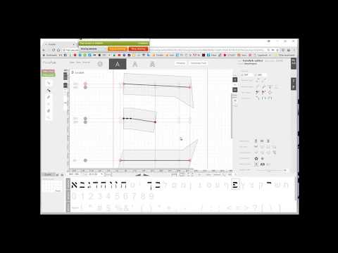
By now I've finished the initial letters drawing (including digits and basic punctuation) - !
And... started forming the font look - 2
There's still a lot of design work, and decision making, due to the short time limitation, Then performing optical corrections and weights extractions... But it's not even noon yet!
0 -
So far that's what I came up with.
Optical compensations are done too.
Soon I'll start the weights extraction....
0 -
OK!
I have stopped streaming for today.
Got out of Fontark with a satisfying (for the task) design, with 3 wights!
From now on it is all Fontlab... fine turnings, cleanups and naming. Hope to be launching the typeface in 2-3 hours.
Here's the result from Fontark so far + pdfs.


0 -
Well, The typeface is up at my website !
3 weights including webfonts, The web page build up almost broke me, lol.
Oh... and it's name is Zusha!
I have 6 hours of recordings of the Fontark phase. Will get them edited and shared.
Getting ready for tomorrow's typeface, and I think I'll go for the Latin one this time... I have a sketch of some not too bright design, but also an idea of how to spice it. Going to be challenging
See you in few hours...1 -
It would be good marketing to take your long recordings, cut them down to time-lapse videos, and post them to YouTube.2
-
Thanks James, will do. It is also very pleasing to watch real fast, it shows the huge design process I go through in such a short time, and this is what Fontark is all about, it is a Design tool.James Puckett said:It would be good marketing to take your long recordings, cut them down to time-lapse videos, and post them to YouTube.
Day 2!
Starting late today (2PM here, I'll calibrate to US time soon : ) since the web stuff took me too long yesterday.
This is my reference for the day...
The concept is minimal fast transitional strokes, sword like, but more curvy, and I'm going to test how much can it be stressed across weights.
The reference is mainly to show me the emphasis and direction of the strokes, see what will come out... Starting with blank glyphs set.
Watch it happens here...
https://www.screenleap.com/afontadayweek_2
0 -
Upper case draft is ready...

0 -
A twist in the lower case...
Going to mix the two now. Advises are welcome...
0 -
The last two posts look like very different typefaces. The first one might need a calmer /W and a more readable /G (it's /Б at the moment).
I suppose the eclecticness of the second post is desired to some degree, but the /m is overdoing it IMHO. You're going to need automatic alternates to avoid sequences like the /p/p in «appropriate».
0 -
Thanks Christian! It is all on the make right now and going to change a lot. I'll give it one or two more hours and try the weights testing, I think it'll help to make some decisions.0
-
Getting late
That's where I am with this font, and I think it is reasonable for the task of the day.
If you have more comments I'll be very happy to hear them, and will be able to tune things up things for the next two hours or so, in which I'm going to complete the digits and other essential characters, and get ready for the weights fun.
Will return broadcasting in about half an hour.
Check up the pdf as well 0
0 -
Here are the weight extraction experiments (before clean ups)
I'm going to fix and release tonight only the 2 middle weights... And get ready for tomorrow : )


Check out the digits too...
0 -
Eventually I've decided not to release DAY2's font. I'm not satisfied of it and would like to keep on developing it later.
Moving on to DAY3... Today's font will be a gesture to a traditional Hebrew font, and I will not nudge you here about it
I'll keep on broadcasting for the rest of the week at: https://www.screenleap.com/afontadayweek
You're invited to visit.
1 -
New version looks more harmonious, though some individual glyphs are still ungainly in the bold (/m in particular). You might also want to shift the weight in /Q's tail to the right to avoid that clumping.
Generally, the transition between fat and thin strokes is a bit too abrupt in some letters (/o, /zero etc.).
The /nine is not legible; I'd parse that as a /four.
0 -
Yes, I've done some work there, but was caught by about 3 different stroke styles and couldn't resolve it in time. I like most the E' and some other letters that seems to me as if they were a knife cut on a paper with a nice 3d effect, something like this:Christian Thalmann said:New version looks more harmonious...
(Someone must have made a typeface of that kind I believe)
About the weight, I've stretched it too much with the bolder version and forgot to make the lc slightly lighter, but it works really cool. That was the fastest part in this particular design, and definitely need some more attention.
I agree with the rest as well, thanks!0 -
It has ended!
5 days in which I woke up every day, sketching a font and by the end of it I have released*** a brand new typeface. The recordings of the process of each day will be edited and published soon.
*** I have released 3 typefaces as draft typefaces, and will continue developing (most of) them later on, 1 typeface as a free typeface, and didn't release 1 typeface (the Latin one - needs more development)
Attached a pdf with the full list and samples of the fonts created during this week.0 -
Exactly a week ago, it was DAY2 of the font-a-day-week session I made, and now day2's video is ready.
I managed to squeeze the entire work with Fontark (which took about 5-6 hours, not including breaks) to a 30 minutes video. From a blank set of glyphs to 4 OTF files from Extralight to Extrabold.
I wish to remind, that this is first and foremost a demonstration of the unique methods, and capabilities of Fontark as a type design tool. It wasn't made to suggest that type design and development should be a fast process. Design work require time, and it and it's quality is not defined by time.
It is just that the efforts a "good" tool can save you, you can invest in the creative aspects, as I hope you can see in this video, that doesn't demonstrate a technical execution of a set in advance plan, but mainly, a creative act.
Full screen watch is recommended, and pauses when some titles shows up.
Oh, and should I mention... there are NO cut-paste-Stick-stitch-weld-join-glue-etc' actions involved in the process what so ever.
0 -
Things to notice in the video...
The designer orientation of the User Interface
- There are no commands in menus, every action is accessible by a click when it is optional. (Those menu-list-commands were "invented" by programmers, not by designers). If you don't find the button/command you want to use in a glance, it doesn't exist.
- The UI is "fixed". No floating windows, no customisation... everything in the UI is set for you to focus on what you do, not on the frames and structure elements.
The simplicity of... everything.
- The basic "unit" in FA is a 2 Nodes path, a segment. It can be either straight or curve... FA uses the computing power to do the rest.
- Fully controllable Cross-glyphs-sync, although it is hard to understand that all the font glyphs are connected-by-demand, The sync system is brutally simple. There's the Matrix, which we call a fluid grid, and the SmartXs (SX) which are actually a set of anchors, and you can select the specific glyphs you want to operate at any given time, be it a single glyph or the entire set of glyphs.
This is the infrastructure... all the rest is in the hands of the user.
0 -
I have started the font a day week, with something simple, I had to, in order to understand the amount of work and how to spread my efforts along the day, for the rest of the days of that week.
OS_Zusha, the 3 weights cursive Hebrew typeface created that day is therefore a very simple and basic structured typeface, but not at all a trivial one, as such, it demonstrates pretty well the basics of Fontark.
I have edited the recordings of the entire design process of Zusha, from the first click to the final design-stage* in these four 15min video clips:Part 1 - Constraction and basic characters forming.
https://youtu.be/wxZtRvNv8ngPart 2 - Development of the design and styling
https://youtu.be/a38SECnwVA0Part 3 - Optical compensations stage.
https://youtu.be/3-zBxeJoZDYPart 4 - Final design stage.
https://youtu.be/Va3cEA09XQsThe video doesn't include the weights extraction process, because I wasn't aware of the 3 hours screen recording limitation the the broadcast and screen recording service I used was under, and it doesn't includes the clean-up and production processes I have done with Fontlab before releasing the typeface that very day at my website: http://www.ofirshavit.com/home/zusha/
 0
0 -
Day 3's font, Villi-stense, a stencil gesture to the traditional Hebrew Vilna typeface, demonstrates a different technique with fontark.
Done entirely "by sight" (no tracing/layering/measuring) and only one weight.
2 X 15min speed up clips this time:Part 1Part 2Villi-stense was released as a free font, so you can even examine it.
0 -
I don't know much about Hebrew, but Villi-stense looks awesome!
1 -
Thanks a lot @Jasper de Waard and @Nathan Zimet.Jasper de Waard said:... Villi-stense looks awesome!
Any impression of Fontark?0 -
Last video, of the 5th day typeface - Egul
2h 40m of sequential work (after editing) accelerated X10 to a 24m video, from the first scratch to 2 final and balanced weights of Egul typeface.
This time with a 7X7 Matrix, which is 49 SXs (anchors), much more than needed to most sans. I usually use the more convenient 5X5 Matrix.
The amazing thing is that in such a short time, the amount of pure design and development time was about 75% ! The rest 25% of time was dedicated to the basic construction (2 first min in the video), and the bold version manual adjustments (4 last minutes).
Hebrew is foreign to most of you, but I believe anyone can see quite clearly the huge transformation and the amount of tests and gradual modifications the typeface is going through from the rough construction start to the final stage.

0


 https://youtu.be/lc0E8Z0Sg1E
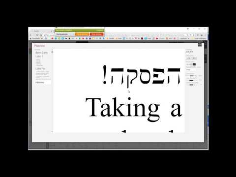 https://youtu.be/ASW-RYqxnmQ
Categories
- All Categories
- 46 Introductions
- 3.9K Typeface Design
- 489 Type Design Critiques
- 572 Type Design Software
- 1.1K Type Design Technique & Theory
- 665 Type Business
- 878 Font Technology
- 29 Punchcutting
- 532 Typography
- 121 Type Education
- 330 Type History
- 81 Type Resources
- 111 Lettering and Calligraphy
- 32 Lettering Critiques
- 79 Lettering Technique & Theory
- 563 Announcements
- 97 Events
- 116 Job Postings
- 169 Type Releases
- 180 Miscellaneous News
- 269 About TypeDrawers
- 53 TypeDrawers Announcements
- 114 Suggestions and Bug Reports