History of Spurless Typefaces

Connor Davenport
Posts: 36
in Type History
Hi everyone!
Does anyone know the origin of spurless typefaces? e.g. DTL Prokyon, Karbon, etc,
Does anyone know the origin of spurless typefaces? e.g. DTL Prokyon, Karbon, etc,
0
Comments
-
They go at least as far back as the early constructivists. If you want a stretch, maybe even Cuneiform, or perhaps early greek inscription. I know at least I was doing it in the early sixties but that is way late in the game, and I was not alone by any stretch.0
-
Thank you Chris!0
-
When I think of 'early' spurless I always think of Skia, where the letterforms 'take inspiration from 1st century BC Greek writing'. It certainly has more of an early, glyphic sensibility than the more contemporary spurless typeface designs.0
-
It’s more significant in otherwise “normal” types, eg Bernhard Gothic, than square types such as City. (Both c. 1930)
0 -
AFAIK the first type designer to do it was Hans Reichel.0
-
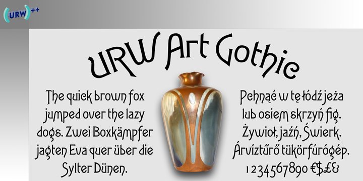
I think Gustav Shroeder's Art Gothic from 1884 was probably influential. You know it from Murder She Wrote. It seems like the kind of thing that would have appeared on posters before it arrived in metal/wood. Advertiser's Gothic is a well-known, early spurless design but it came out 33 years later.
3 -
I agree with both @Ray Larabie and @Nick Shinn:
- Bernhard Gothic (1929–1930) is the oldest typeface I know of that looks quite similar to DTL Prokyon and Karbon. It is their oldest direct spiritual ancestor, IMO. http://www.myfonts.com/fonts/spiecegraphics/bernhard-gothic-sg/
- Art Gothic (1884) I see as one of the earliest typefaces in what would become art nouveau (though I won't be surprised if others disagree, as art nouveau proper started a decade later). While exploring organic curves, art nouveau lettering and type sometimes dropped those pesky spurs. In these cases it is just part of a bigger “look,” rather than the primary design feature. http://www.myfonts.com/fonts/urw/art-gothic/
1 -
Thank you everyone! I really appreciate it0
-

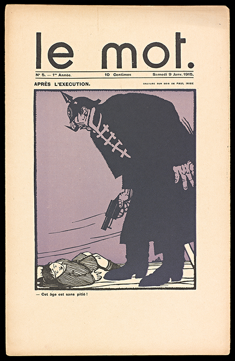
This ain't type, but it is a set of spurless geometric letters that predate the Constructivists.0 -
It’s all just a little bit of Typophile repeating …
In this thread from 2010, Gustavo mentioned Semplicità (1930), and Karsten brought up a Grotesk made by Wagner & Schmidt in ca. 1920, cast by other foundries as Universal, Polar-Grotesk, Rund-Grotesk, Kristall-Grotesk – see a sample.
1 -
Come on, get real. It doesn’t count if the m and n don’t have the feature, otherwise you might just as well include Gill Sans and Hobo, and then where would we be? Spurless is spur-less, not some-spurs or very-few-spurs!4
-
@Nick Shinn I think it's the idea that counts, no matter how few glyphs it's applied to.
0
Categories
- All Categories
- 46 Introductions
- 3.9K Typeface Design
- 489 Type Design Critiques
- 572 Type Design Software
- 1.1K Type Design Technique & Theory
- 664 Type Business
- 877 Font Technology
- 29 Punchcutting
- 530 Typography
- 121 Type Education
- 328 Type History
- 81 Type Resources
- 111 Lettering and Calligraphy
- 32 Lettering Critiques
- 79 Lettering Technique & Theory
- 562 Announcements
- 97 Events
- 116 Job Postings
- 169 Type Releases
- 179 Miscellaneous News
- 269 About TypeDrawers
- 53 TypeDrawers Announcements
- 114 Suggestions and Bug Reports


