Experimental symmetrical typeface

Adam Jagosz
Posts: 690
I took the challenge of desigining a naturally flowing, legible font where all or nearly all glyphs are horizontally symmetrical, as I thought Google query for "symmetrical font" returned unsatisfactory results. Its application could include vertical texts written on a glass pane or neon signs (a kind of totems) or maybe necklace pendants with names. Anyway, however impractical and useless the font is, it was fun making it.
2
Comments
-
Why the unconventional bar of /A/?0
-
Quite difficult to read, but I completely love it!
1 -
2
-
Worth pondering.
And effortless ambigrams of palindromes! :-)
BTW just in time for: http://prototype.typegallery.com/
0 -
That's a good questionCraig Eliason said:Why the unconventional bar of /A/?") Possibly a remnant of my previous trial at this task where I wanted the /A to mimic the design of /S. It also takes after Corcaigh Gaelic type, as does lowercase /g. /B is also inspired by insular capitals. I know it all probably isn't working towards legibility...
Possibly a remnant of my previous trial at this task where I wanted the /A to mimic the design of /S. It also takes after Corcaigh Gaelic type, as does lowercase /g. /B is also inspired by insular capitals. I know it all probably isn't working towards legibility...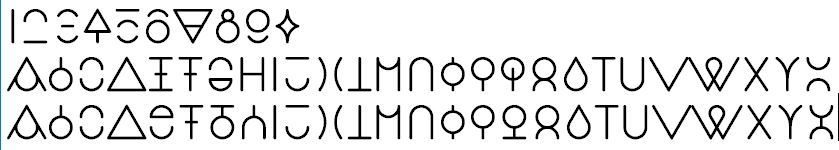
I also had an angular version of that:
Thanks Pablo!
Nick, thank you for letting me know. I have a few other names in handy, I'll just go back and reconsider them.
0


Categories
- All Categories
- 46 Introductions
- 3.9K Typeface Design
- 489 Type Design Critiques
- 572 Type Design Software
- 1.1K Type Design Technique & Theory
- 659 Type Business
- 871 Font Technology
- 29 Punchcutting
- 528 Typography
- 121 Type Education
- 327 Type History
- 80 Type Resources
- 111 Lettering and Calligraphy
- 32 Lettering Critiques
- 79 Lettering Technique & Theory
- 560 Announcements
- 95 Events
- 116 Job Postings
- 169 Type Releases
- 179 Miscellaneous News
- 269 About TypeDrawers
- 53 TypeDrawers Announcements
- 114 Suggestions and Bug Reports