This week in type: WHAT IS SANS SERIF?

Nobody does type marketing better than Hoefler & Frere-Jones Co. You heard about Operator everywhere. You saw the video. You heard about it on a Monocle podcast. To paraphrase Will & Grace, dead people know about Operator. And it solves a problem nobody has, namely “I don’t have a really good font to ‘code’ in,” where “code” is a verb. Everybody who “codes” solved the type problem with any of the last three or four typeface releases that promised to do so. Someday somebody will design a font for “coding” and will present sample uses that do not resemble Windows 3.1 angry fruit salad. I use black on pink.
Richard Ishida outglyphs himself: Hieroglyphics picker. (Those “code points” are awesome.)
Hobo. (Hobeaux!) San Francisco.
Do you remember a hand carrying out calligraphy in the intro video for the iPad Pro? No, you don’t, because that was in the video for the Apple Pencil. I know whose hand that wasn’t, but JFP gave it a shot for real.
Almost as many Webfonts in Blendle as there are ways to render the word “Webfonts,” namely 200.
Upside-down N (but lOWERCASE l).
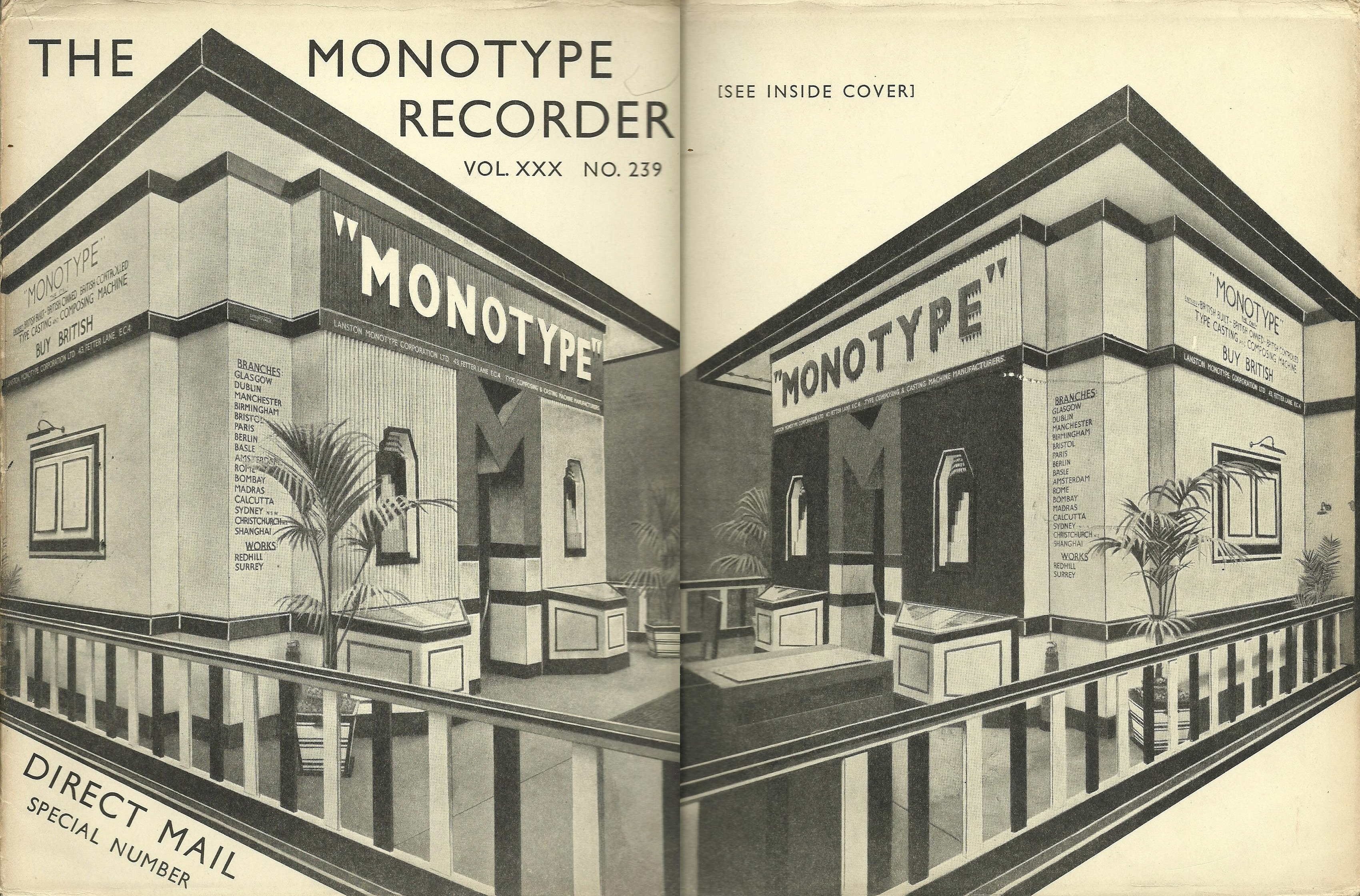
You can download scans of 64 issues of The Monotype Recorder. I did. (Always use an FTP program, not a browser.)
“How to make your text look futuristic” (but Desert Chrome).
Speaking of which, is the value proposition of a streetcar (“LRT”) in Brooklyn actually the unrealistically-well-rendered futuristic type of its destination signage?
I have heard the adorable Michael Bierut spontaneously curse in a video recording, but I am not going to tell you where. He cites Miles Davis as an influence, while some of us have Desert Chrome or Letraset or Space: 1999 as influences. Xavier Dolan basically didn’t see any movies older than Titanic, either.
“WHAT IS SANS SERIF?”
(Bad type on Jeopardy.)
Sansserif Cherokee that is not Gadugi or Phoreus.
Also not Gadugi: Microsoft allegedly has “a font and system of text wrapping that makes reading easier for dyslexics – but also faster for those without dyslexia.” (“Easier” vs. “faster.”)
And, by any standard, the biggest news of the “week,” covered in another drawer: James Montalbano gets the royal shaft, and reacts appropriately.
- “This notice terminates the Interim Approval for Use of Clearview Font”
- Times guest editorial: “I can’t help wondering if something else is afoot. To use Clearview, state departments of transportation had to pay a licensing fee”
- Tsunami-like aftershocks felt as far away as Ohio
Comments
-
Vanilla chokes on emoji.1
-
The system mentioned in the fastco piece, and the loose fonts...
http://www.onenote.com/learningtools
https://www.microsoft.com/en-us/download/details.aspx?id=507210 -
Thanks for posting these Joe - very amusing and a great roundup!
 1
1 -
I’m glad you like them. And enjoy them while they last!Dave Crossland said:Thanks for posting these[,] Joe - very amusing and a great roundup! 0
0 -
Anywhere to read the Michael Bierut WSJ article elsewhere? WSJ is paywalled.0
-
Google the title.0
-
Categories
- All Categories
- 46 Introductions
- 3.9K Typeface Design
- 489 Type Design Critiques
- 572 Type Design Software
- 1.1K Type Design Technique & Theory
- 659 Type Business
- 874 Font Technology
- 29 Punchcutting
- 528 Typography
- 121 Type Education
- 327 Type History
- 80 Type Resources
- 111 Lettering and Calligraphy
- 32 Lettering Critiques
- 79 Lettering Technique & Theory
- 560 Announcements
- 95 Events
- 116 Job Postings
- 169 Type Releases
- 179 Miscellaneous News
- 269 About TypeDrawers
- 53 TypeDrawers Announcements
- 114 Suggestions and Bug Reports


