Super Grotesk scans

Thierry Blancpain
Posts: 222
in Type History
For a historical background post about Zhurnalnaya roublennaya, I’m looking for a scan (or good photo) of a Super Grotesk specimen that we could use. Zhurnalnaya is the hot metal (and phototype) original that GT Eesti is loosely based on.
I couldn’t find a photo on Flickr of it that includes CC license and commercial use, so I figured I’d see if anybody here could help. Thank you!
I couldn’t find a photo on Flickr of it that includes CC license and commercial use, so I figured I’d see if anybody here could help. Thank you!
0
Comments
-
1
-
Optimally the specimen would be from a Schriftguß specimen, but any Typoart specimen would be a great start, too. All Typoart (*1951) specimens are younger than (the Cyrillic portion of) Zhurnalnaya roublennaya, which was first released in 1947.0
-
Hi Thierry, I could offer a plain glyph set if that is enough for your purposes. For images from a proper specimen, ask Jan Middendorp – he posted some scans to Flickr once. Alternatively, ask Ralf Herrmann of the Letter Library. Make sure to show the metal Super-Grotesk as designed by Arno Drescher for Schriftguss in the 1930s, and not the revised phototype version made by Karl-Heinz Lange in the 1980s. Although it bears the same name, latter clearly deviates from the original: larger x-height, harmonized widths, round instead of square dots, several distinct details (splayed M, straight t) – not to mention the style range.
Internationally Zhurnalnaya Roublennaya is probably better known as Journal Sans.
4 -
Hi Florian, that could work, thank you! My email would be thierry at grillitype. I’ll also ask Ralf and Jan.
You’re right to note Journal Sans. Speaking only of the Latin alphabet: aside from the really shoddy drawing quality, it’s about as faithful a revival as ITC Garamond Journal Sans New (released 2014) is drawn better, but also veers far from the original at times, for example with its humanist italic and a Display with totally different proportions.
The upcoming post will show similarities (and differences) between a few older typefaces like Drescher’s and Zhurnalnaya roublennaya, and also contain a general (very short) history of Soviet typesetting.
3 -
Optimally the specimen would be from a Schriftguß specimen, but any Typoart specimen would be a great start, too.
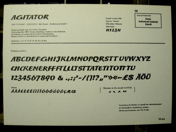
Are you familiar with the standard Schriftmusterkartei (TGL 10-056) every publisher in the GDR used to, or was expected to, have handy? Super-Grotesk and Super-Buchgrotesk are shown fairly exhaustively on those cards—in all weights, styles and point sizes.1
 -
I did not! I know very little about DDR type overall. Thank you, I’ll keep an eye out for those, too!0
-
from @Stephen Coles's Instagram
Large image:
Full sized: https://scontent.cdninstagram.com/t51.2885-15/s640x640/sh0.08/e35/12725137_1687986861482356_1854831573_n.jpg?ig_cache_key=MTE4MzkxNjQ5NTM4NTUwMTIyMw==.2
2 -
Thanks Wei! I’ve been talking to Stephen directly by email. I should be covered!
 Thanks everyone for the help! 0
 -
If you ever need anything else: we have lots of Super Grotesk in real metal type, all sizes. Could always set up some proofs to your spec and print them.3
-
Thank you @erik spiekermann!
0 -
Thank you, these are really interesting.0
-
Here are the rest of the Super Grotesk snapshots I took for Thierry. If you'd like better images (hi-res scans or photos without glare or a bunch of hands all over everything) you can request them directly from Letterform Archive.0
-
By the way, we used @Florian Hardwig’s scan for Ivar Sakk’s article on Zhurnalnaya roublennaya on FIU, the typeface that we revisited as GT Eesti. Thanks again Florian!
0 -
You’re most welcome!
0 -
And I somehow forgot to mention: Thank you also for editing the FIU article, Florian!0
Categories
- All Categories
- 46 Introductions
- 3.9K Typeface Design
- 489 Type Design Critiques
- 572 Type Design Software
- 1.1K Type Design Technique & Theory
- 659 Type Business
- 871 Font Technology
- 29 Punchcutting
- 528 Typography
- 121 Type Education
- 327 Type History
- 80 Type Resources
- 111 Lettering and Calligraphy
- 32 Lettering Critiques
- 79 Lettering Technique & Theory
- 560 Announcements
- 95 Events
- 116 Job Postings
- 169 Type Releases
- 179 Miscellaneous News
- 269 About TypeDrawers
- 53 TypeDrawers Announcements
- 114 Suggestions and Bug Reports


