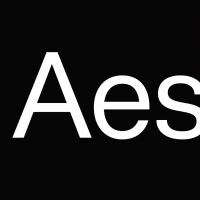
Strange rendering of one letter in on-line PDF reader

Filip Blazek
Posts: 14
Hello,
My client, an advertising office, designs a magazine for on-line previewing based on PDF. Unfortunately, one single letter of the font is rendered with a strange shape around the letter. Accented letters A are affected (single A is fine). The letters look OK in InDesign as well as in Acrobat.
I did everything I could to avoid this problem: I changed direction of curves, I added a few redundant nodes, I did place the shape of Á to another glyph position. The Á is still rendered with the black shape.
Any idea what could be a source of this strange behaviour?

Thanks,
Filip
My client, an advertising office, designs a magazine for on-line previewing based on PDF. Unfortunately, one single letter of the font is rendered with a strange shape around the letter. Accented letters A are affected (single A is fine). The letters look OK in InDesign as well as in Acrobat.
I did everything I could to avoid this problem: I changed direction of curves, I added a few redundant nodes, I did place the shape of Á to another glyph position. The Á is still rendered with the black shape.
Any idea what could be a source of this strange behaviour?

Thanks,
Filip
0
Comments
-
open contours?0
-
No. I tried to export the font from Glyphs, FL Mac, FL Win, still the same issue. Maybe it is a bug of the rendering software but all other glyphs are rendered properly. And as I mentioned, the bug is only related to the online previewing tool.
0 -
Contour direction or double contours?
Are you hinting with an old version of ttfautohint? (current version is 1.4)
0 -
I double checked directions and double contours... I will try to check the hinting, I used the default setting so far. Thanks.
0 -
It might be a hinting issue, but on the other hand it could also be an incorrect OpenType layout feature. If you need help, do let me know and I'll look into it.
0 -
Have you tried rendering the same type in a different piece of software that can also export to PDF? Sometimes PDF can be really weird, and rendering isn't always a problem in the font itself.0
-
Sometimes PDF can be really weird, and rendering isn't always a problem in the font itself.
Yes. Get a description of the PDF creation workflow from the client.0 -
Sometimes PDF can be really weird, and rendering isn't always a problem in the font itself.
I've noticed this, ever get /I or /l stem thickness rendering really wide/bold, with all other characters rendering correctly?
0 -
That's a known thing. It happens in Acrobat when type has been converted to outlines. Rectangular glyphs get heavier. It's a side effect of a rendering trick designed to boost the visibility of thin lines. Fonts are not affected unless they are converted to simple (unhinted) vector shapes.
More here:1 -
@HoeflerCo @Acrobat Go to Acrobat > Preferences > Page Display > and uncheck "Enchance thin lines" under Rendering. Solves the problem!
— Megan Anderson (@Megan_Anderson3) August 30, 20154 -
Dang, that's useful to know Stephen, thanks!0
Categories
- All Categories
- 46 Introductions
- 3.9K Typeface Design
- 489 Type Design Critiques
- 571 Type Design Software
- 1.1K Type Design Technique & Theory
- 658 Type Business
- 870 Font Technology
- 29 Punchcutting
- 528 Typography
- 121 Type Education
- 327 Type History
- 80 Type Resources
- 111 Lettering and Calligraphy
- 32 Lettering Critiques
- 79 Lettering Technique & Theory
- 560 Announcements
- 95 Events
- 116 Job Postings
- 169 Type Releases
- 179 Miscellaneous News
- 269 About TypeDrawers
- 53 TypeDrawers Announcements
- 114 Suggestions and Bug Reports


