Book Cover Lettering

Tristan Bowersox
Posts: 21
I am revisiting the lettering I did for the cover of a novel on the occasion of its sequel coming out. In retrospect, some of the choices I had made were odd, especially having the stress on the upstrokes of the loops... The original and my second take on it are below. I think it's more legible and more consistent, but if there are any critiques you have, fire away. I retained the descender on the /k/ even although I could no longer find an example of it elsewhere...I don't know; it seemed to fit the casual feel of the text composition...
I'll post the sequel's title when I finish it.
I'll post the sequel's title when I finish it.
Tagged:
0
Comments
-
The second version looks much better. I think it could be improved more though, but I guess it also depends on what you want. I'm going to approach this more or less as a type designer where I look for a certain consistency which may not apply in lettering if you want to keep a certain spontaneity and playfulness in the lettering.
I think the weight could be more consistent. Right now you seem to have areas that are darker and some areas that are lighter. The /o in "Mountain" for example could use a smaller and thicker loop like the first /o, or perhaps no loop this time. The /a is too light on the right side, and perhaps /t would work better without a loop as its stem. Perhaps I would also try to bring "Mountain" to the right, "Angels" to the left and give the /M a swash on the left side.1 -
Hi Tristan... I agree with Martin that the second version looks better.
A couple of observations about Ver 2:
The leg of the /R/ looks very light to me when compared with the stem... possibly the bowl too?
The /R/ and /k/ have similar forms. Is it possible to misread as either "Kocky" or "Rocry"?
The contiguous /ch/ ligature in Ver 1 works better for me than the update; the loop on the /k/ in Ver 2 looks abandoned.
You mentioned that you'd retained the descending /k/, which I agree fits the casual composition. It harmonises with the descending /g/ in "Angels", but leaves "Mountain" looking very orderly by comparison.1 -
Thank you both for your comments; they are very astute.
I have the type for the second book here. I would put it up in the original post, but I can't seem to remember how to edit posts...
I'll revise the "Rocky Mountain" part and post it later...0 -
Revised version attached for comparison. Playful spontaneity was indeed my aim, so aside from some thickening of strokes—mainly in the /R and /a—I left it inconsistent, and rather, as Steve implicitly suggested, shook up the orderly "Mountain" with a swash in the middle.
As for a swash on the /M, I am considering that for at least the "Rock Mountain Series" wordmark I am working on, and possibly for the R.M. Sunrise cover, as both are less compositionally constricted by cover imagery.
Edit: here's a version with the swash: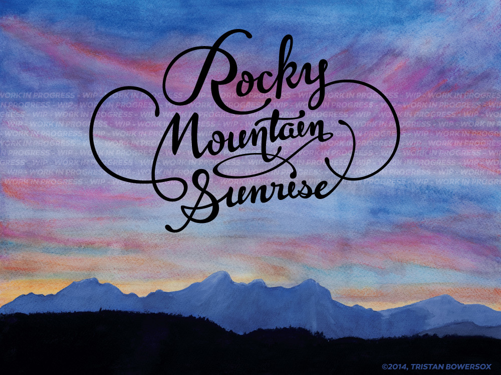 1
1 -
It looks a lot better and more consistent. I think I would make the /R a bit lighter and make the swash of /e more circular, because the current shape feels uncomfortable to me. Other than that I think it works quite well.0
-
The 2 biggest improvements I can think of are:
1. Make the the thick/thin contrast of the lowercase (ountain & unrise) the standard and use it on the caps and flourishes. The M and S and flourishes seem to have very little contrast.
2. Change the slant on the R to better match the rest of the lettering.3 -
Personally, I think it looks good as-is now. You don't want to fix it too much if you want to keep a certain organic flair, imo.0
-
Adrien — Stephen's suggestion to correct the pen contrast will more accurately emulate handwriting, making it less mechanical, not more.2
-
Well, I guess I just lack experience with this stuff and lettering in general in order to be able to critique.0
-
Well, I guess I just lack experience with this stuff and lettering in general in order to be able to critique.
Perhaps not. The thing to remember is that although indeed a high consistency would normally suggest a less humanist approach when it comes to typefaces, within the realm of calligraphy you would expect a certain consistency in the stroke and contrast. Stephen's suggestions would increase the consistency of stroke and contrast — as if done by the same pen and hand — without sacrificing the design. In fact the suggestions he made would also improve the color (general distribution of black on white), so visually the design will look better as well.
1 -
Glad to see this is getting some more attention, though I'm fast approaching my deadline, so I'll have to see how much I can alter before then...
With regard to the swash on the /e, though, I can tell you that it is because of the way the title fits on the front cover. The Series logo, by contrast, is much rounder.
I will look again into adding contrast to the swashes. My feeling initially was that they distracted slightly from the text when they were thicker.
Thank you all for your suggestions.0 -
Revision showing the addition of contrast to the curls. I have mixed feelings about it... I think it works in places, but the lower left one in particular looks slightly awkward and I can't place why...
Also, my wife noted that the swash on the /s looks like it doesn't belong. She said it reminded her of the long-toe boot fad in Mexico a few years ago, an image I can't unsee... =_=
[Edit]: Added contrast to the /R loop, rotated /R, and brought capital contrast closer to lowercase. 1
1 -
Hi there, I'm a letterer and will be posting stuff soon, so wanted to get involved with a few suggestions even though it seems like you're nearly there from all the posts.. Anyway, all subjective and just another perspective that I hope is helpful in some way. Forgive the messy markup, just find it quicker to than describing everything!
Cheers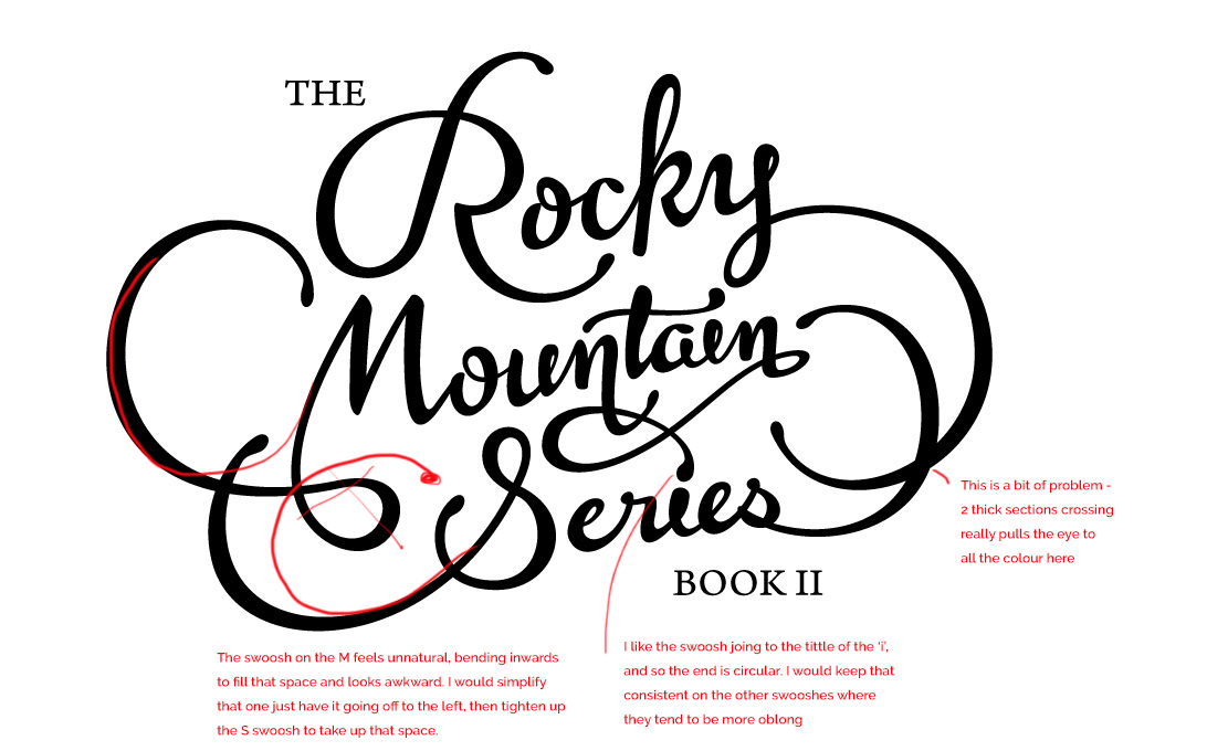 3
3


Categories
- All Categories
- 46 Introductions
- 3.9K Typeface Design
- 489 Type Design Critiques
- 572 Type Design Software
- 1.1K Type Design Technique & Theory
- 659 Type Business
- 874 Font Technology
- 29 Punchcutting
- 528 Typography
- 121 Type Education
- 327 Type History
- 80 Type Resources
- 111 Lettering and Calligraphy
- 32 Lettering Critiques
- 79 Lettering Technique & Theory
- 560 Announcements
- 95 Events
- 116 Job Postings
- 169 Type Releases
- 179 Miscellaneous News
- 269 About TypeDrawers
- 53 TypeDrawers Announcements
- 114 Suggestions and Bug Reports