Type in a Digital Landscape, by Bruno Maag

Dave Crossland
Posts: 1,522
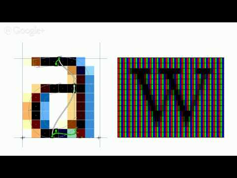
Bruno Maag first presented his 'Type in a Digital Landscape' talk at the BITS MMXIV conference in Thailand a few weeks back, and I asked him to present it online as a 1 hour video with me.
He discusses how logotypes can be improved by type designers, the importance of hinting, and introduces the design process of some recent projects by Dalton Maag.
 http://youtu.be/BMr4aBdag3Q
He discusses how logotypes can be improved by type designers, the importance of hinting, and introduces the design process of some recent projects by Dalton Maag.
http://youtu.be/BMr4aBdag3Q 6
Comments
-
I had to stop this at 13 minutes.0
-
Very interesting lecture. I particularly found the part about designing big type systems involving multiple scripts to be fascinating. I had no idea they should be designed at the same time but it makes sense. Thanks for posting this.0
-
I forgot to mention the treatment of the Jonathan Saunders logotype and the Michel logo. Nicely done. It's strange the people at Jonathan Saunders didn't even respond.0
-
I'm curious who disagreed with my statement and for what reason.0
-
(If you hover over the disagreement, it shows you who did it)0
-
Hi Martin. I disagreed with your statement that "it's strange the people at Jonathan Saunders didn't even respond."
What kind of response do you think was likelier than silence? If they don't really care much about the quality of their logo design, it's unlikely they'd respond. If they (mistakenly) still believe the logo they have is good, it's unlikely they'd respond. If their minds are changed about what they have, it's far more likely I think that they'd quietly plan a revamping, rather than just adopt this unsolicited redesign that comes out of this somewhat embarrassing critique.4 -
What kind of response do you think was likelier than silence? If they don't really care much about the quality of their logo design, it's unlikely they'd respond.
Assuming they don't care about the quality of their logo design and that's what I find strange. I'm going to assume they just didn't see that their logo was of inferior quality, but certainly anyone can see how Bruno Maag's version is an improvement. If such an improvement is presented to you to use for free, why wouldn't you at least respond?
It would still suit them well to respond.
If they (mistakenly) still believe the logo they have is good, it's unlikely they'd respond.
I certainly don't see it as something logical that they didn't bother to respond either way. When I was looking for a job, I sent out at least 20 personal emails and only one company ever mailed back. I consider that to be unprofessional, egocentric and callous. More and more companies are behaving in such manner, where they will only respond and be friendly as long as they need you.If their minds are changed about what they have, it's far more likely I think that they'd quietly plan a revamping, rather than just adopt this unsolicited redesign that comes out of this somewhat embarrassing critique.
I doubt they saw the public critique, but if they did, I still think it would have been better for them to admit their logo didn't represent what it should represent. Whether they're quietly planning a revamping or not, right now their silence implies they think their logo is just fine and they don't care about any improvements. I wouldn't want to buy any products from a company that thinks like that. Unfounded haughtiness.0


Categories
- All Categories
- 46 Introductions
- 3.9K Typeface Design
- 489 Type Design Critiques
- 572 Type Design Software
- 1.1K Type Design Technique & Theory
- 658 Type Business
- 870 Font Technology
- 29 Punchcutting
- 528 Typography
- 121 Type Education
- 327 Type History
- 80 Type Resources
- 111 Lettering and Calligraphy
- 32 Lettering Critiques
- 79 Lettering Technique & Theory
- 560 Announcements
- 95 Events
- 116 Job Postings
- 169 Type Releases
- 179 Miscellaneous News
- 269 About TypeDrawers
- 53 TypeDrawers Announcements
- 114 Suggestions and Bug Reports