Needy Italics on a Friday Night

Michael Vokits
Posts: 214
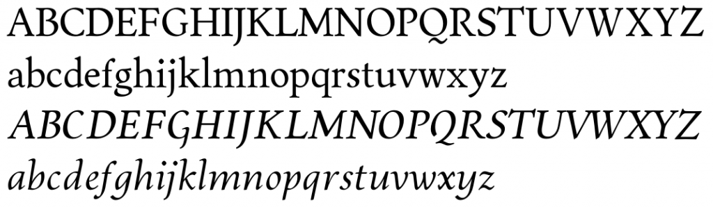
Hello, all. Nothing else to do (kids and fiancée are asleep), so I thought I'd post and beg for advice. I've been trying to make an italic to match this oldstyle roman, but I just can't get it right. To my admittedly untrained eyes, this italic is too stiff, formal, restrained and yet too... ornate? It has the mechanical rigidity of a Didone but lacks the grace and details. It seems more pedantic parody than living design.
0
Comments
-
Could I see this in context? The first thing I do notice is the unusually large gap in Q. I'm not sure if an open Q like that is the best option anyway. /C seems particularly stiff.0
-
Maybe try to make it a little bit less narrow. This will also allow you to make the forms more round, which might fit the roman better.0
-
Hello. Did some serious redesign, and the (lengthy) specimen shows the roman then the italic. The family's name ("MignonV") is strictly temporary -- please don't judge my lack of naming skills.0
-
I think h/m/n/y and particularly /r could be more condensed. The spacing after /t could also be tighter. The /e is slightly falling backwards.
I also think the letters with ascenders are probably too vertical. I feel there is too much tension between the angles.0 -
New forms. Still not sure about the "too vertical" -- you're right, but I'm not sure how to fix it... I'm trying to follow the rules and have less of an angle for taller/longer glyphs than for shorter, but I'm probably overdoing the difference!0


Categories
- All Categories
- 46 Introductions
- 3.9K Typeface Design
- 489 Type Design Critiques
- 572 Type Design Software
- 1.1K Type Design Technique & Theory
- 658 Type Business
- 870 Font Technology
- 29 Punchcutting
- 528 Typography
- 121 Type Education
- 327 Type History
- 80 Type Resources
- 111 Lettering and Calligraphy
- 32 Lettering Critiques
- 79 Lettering Technique & Theory
- 560 Announcements
- 95 Events
- 116 Job Postings
- 169 Type Releases
- 179 Miscellaneous News
- 269 About TypeDrawers
- 53 TypeDrawers Announcements
- 114 Suggestions and Bug Reports