The ‘gasp’ Table
What is the ‘gasp’ table?
The ‘gasp’ table (Grid-fitting and Scan-conversion Procedure Table) in a TrueType font plays a very important role in how a Hinted TrueType font will render on-screen on Microsoft Windows. In general, the table contains information that describes the preferred rasterization techniques for the typeface, as well as specifying the combination of sizes and rasterization modes at which hinting should be applied. The following series of posts covering the ‘gasp’ table will go into more detail about the original intention of the table, how it has evolved, editing the different fields, and covering how the style of hinting used in the font effects how the font will render on screen. The following glossary of terms may be a useful reference while reading this series.
Let’s start with some historical background, as this is relevant to how the ‘gasp’ table works today.
‘gasp’ table: Historical overview
Font smoothing, became the default rendering in Windows 2000 and was first released as an option for Windows 95 in the Plus! Pack. Font smoothing was a hybrid grayscale anti-aliasing technique designed to improve the contrast of fonts over traditional anti-aliasing techniques. Traditional anti-aliasing works by rasterizing the font at a much higher resolution called overscaling, or oversampling, then downsampling the bitmap. With traditional anti-aliasing the overscaling does not have Grid-fitting/Hinting applied. This can result in significant blur in the rendering. Font smoothing uses this same anti-aliasing technique, except that it applied ‘font hints’ or ‘grid fitting’ to snap vertical and horizontal edges of the font outlines so that they aligned with the pixel grid, prior to overscaling the outline data. In this situation, most horizontal and vertical stems of a font, when overscaled, cover 100% of the underlying pixels, and when downsampled return the text foreground color, which is usually black. Diagonal and round features of the font will not have full coverage of the pixel and will usually return some shade of gray, reflecting the coverage of the underlying pixel. When sampled with this technique horizontal and vertical features have maximal contrast while diagonals and rounds—which traditionally suffer from aliasing — get the ‘softer treatment’ reducing the aliasing. We liked this technique because of the better contrast — but we found a few problems. For example, in the uppercase K, the left hand vertical stroke is ‘black’ while the diagonals would appear to be ‘gray’. At small font sizes on screen where the strokes are one pixel or less, this led to weird depth cues where the vertical stroke comes to the foreground while the diagonals go to the background. (See Figure 1. below, middle) We found that once the stem-width moves to at least two pixels, this problem tends to go away. Bold fonts were often treated slightly different with bold values enabling font smoothing at lower sizes. If the ‘gasp’ table was not present in a typeface, the rasterizer applied default rules to decide how to render the glyphs. 
Figure 1. Arial 10 point (13ppem)
Top: Font Smoothing, No Grid fit.Significant blur on horizontal stems and rounds. Note: This is the equivalent of traditional Anti-Aliasing
Middle: Font Smoothing, Gridfit: Note: Uppercase K, the left hand vertical stroke is ‘black’ while the diagonals would appear to be ‘gray’.
Bottom: Bi-Level Rendering, Gridfit: Two colors represent the font, the foreground color and the background color. Sharp vertical and horizontal stems, aliasing on diagonals and rounds. The core fonts that Shipped with Windows 3.1, including Arial, were hinted for Black and White rendering, (Aliased) to ensure best display at the sizes where Font Smoothing was disabled.
To address the problem, as described in the Cap K example, the ‘gasp’ table was created. The table allowed the font to determine the sizes that Font Smoothing should be enabled and also allowed the font to tune the sizes at which hinting was enabled. This allowed fonts to determine the exact size that font smoothing turns on or off. Most fonts that provided this level of information turn off hinting and turn on grayscale anti-aliasing below 9 pixels per em (PPEM), where the glyphs are too small for hinting to be useful. This is the equivalent of 7 points on a 96 PPI screen. Above 9 PPEM, hinting was turned on, and font smoothing was typically turned off until the main stems of the font were around two pixels wide. This resulted in the highest contrast, and sharpest text on screen. Once the main stems were two pixels wide, font smoothing and hinting remain on as the sizes increase. Two pixel wide stems are usually chosen because there is usually enough “backbone” of foreground colored pixels to keep the stem contrast high. So although font smoothing was the default, many of the common system fonts such as Times New Roman and Arial, and later Verdana and Georgia, when displayed at typical reading sizes, would render as bi-level, or black and white.
ClearType: Extending the ‘gasp’ table
With the introduction of ClearType, we discovered a similar but different issue. An earlier version of the ClearType Rasterizer, used asymmetric rendering because it gave better contrast at lower sizes At larger sizes, however, some aliasing was still evident especially on shallow curves. (See Fig.2 below) The ClearType rasterizer was updated in DirectWrite, and more recently in GDI, to support symmetric rendering, which provides antialiasing in both the vertical and horizontal directions, making for much smoothing rendering at larger sizes. Unfortunately, the symmetric filter did not work well at all sizes. As the size decreases, fewer pixels make for coarser rounding, and TrueType hints are needed to maintain stroke consistency while also keeping strong contrast of foreground vs background. At these small sizes, the grey pixels that symmetric rendering introduces, make up a significant proportion of a character’s bitmap, filling in counter spaces such as the interior of the letters ‘e’ and ‘a’, making these characters look heavier and blurred. (See Fig.3 below) It can be beneficial for some fonts, (particularly text fonts, intended for longer reading) to switch to an ‘asymmetric rendering’, i.e.: without vertical antialiasing. This helps to keeps text contrast higher, an important feature. We had hoped to come up with a filter that would support a symmetric filter with high contrast at all sizes but instead settled on changing to a symmetric filter at a threshold value. A new set of flags were added to the ‘gasp’ table so a font could now tell the rasterizer when to switch to the symmetric filter. These new flags were intended to only apply when ClearType is being used.
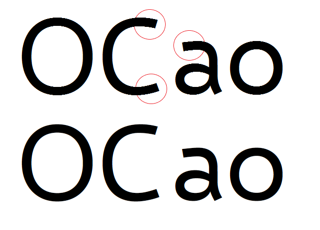
Figure 2. Symmetric v Asymmetric rendering at a larger point size.
Top: ClearType Asymmetric rendering
Bottom: ClearType Symmetric rendering
Compare the top and bottom portions of the letter ‘C’ and ‘a’ above, where the shallow horizontal curve produces a jagged, high-contrast step pattern in the top example, and and a smoother progression in the bottom example. The symmetric rendering is applied at larger sizes of type, and may be controlled in a font specific way using the ‘gasp’ table. Font developers may determine at what sizes the rasterizer will apply asymmetric rendering and at what size to switch to symmetric rendering. It is important to note that this smoothing should not be applied at typical text sizes on screen, because it can reduce the overall contrast of the glyph image. This can make text type appear blurred and undermines readability.
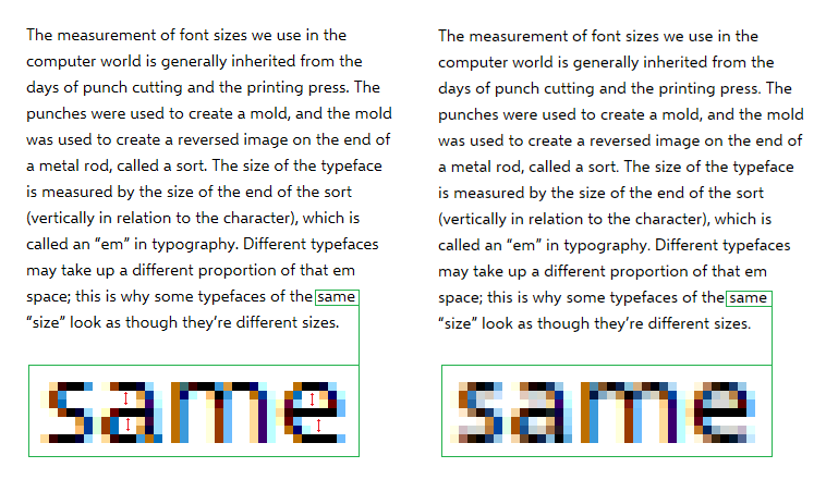
Figure 3. Showing the VTT Demo font set at 15ppem (This is the equivalent of 11 point on a 96 PPI screen)
Left: Hinting enabled and Symmetric font smoothing disabled via the ‘gasp’ table. The result is lighter, but sharper text overall. To ensure consistent rendering, stems must be hinted with a combination of Links and cvt's. I will cover this in more detail in the next post in the series.
Right: Hinting enabled and Symmetric font smoothing enabled via the ‘gasp’ table. Note: The additional grey pixels introduced by symmetric smoothing causes the counter of ‘e’ and ‘a’ to fill in, making the characters heavier and introduces more blur.
This font shown in the example above ships with Visual TrueType. Once VTT is installed the font can be found in Documents>Visual TrueType>sample>VTTDemo.ttf
To view and or edit, the ‘gasp’ table in the font, Open the font in VTT > Menu> Edit > Edit Gasp table...
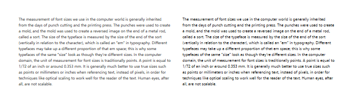
Figure 4. Showing the VTT Demo font set at 7ppem. (This is the equivalent of 5 point on a 96 PPI screen) At very small sizes, symmetric rendering and no hinting is recommended, where the glyphs are too small for hinting to be useful.
Left: Hinting disabled and Symmetric font smoothing enabled .
Right: Hinting enabled and Symmetric font smoothing enabled .
The ‘gasp’ table in VTT Demo font is set to
- Disable hinting, and enable symmetric smoothing below 8ppem.
- Enable hinting, and disable symmetric smoothing from 9 to 18ppem.
- Enable hinting, and enable symmetric smoothing @ 19ppem and above.
Setting the ‘gasp’ Table for ClearType and DirectWrite.
As discussed, the choice of which rendering mode to use for a given size is controlled by the OpenType ‘gasp’ table. Specifically, the ‘gasp’ table lists a set of size ranges, and for each, a set of flags that specify whether to apply hinting and whether to use symmetric or asymmetric rendering. Font Designers can choose the size ranges and rendering modes that best suit the style of the font, and hinting method used, and that provides a smooth progression of weight across size ranges. These settings may vary from font to font, within a family, as well as family to family.
Choosing ‘gasp’ table ranges
The ‘gasp’ table provides quite a bit of flexibility, but the current hinting and rendering environments do not require complex ‘gasp’ tables. Microsoft suggests that most fonts only require three or four ranges:
Very small sizes: (typically 0-8ppem*), Render un-hinted, symmetric.
Moderate sizes: (typically 9-17ppem*), Render hinted, asymmetric.
At larger sizes: (> 17ppem*), Render hinted, symmetric.
Very large sizes: (Optional) (> 100ppem * ), render un-hinted, symmetric
(approximatively * )
Though the above is a rough guideline; not all fonts in a font family will have exactly the same ‘gasp’ table.
A good guideline for choosing ranges is to consider the thickness of horizontal hairlines / thin strokes that are important for legibility – e.g. the crossbar of the lowercase ‘e’. At some smaller sizes, this thickness will resolve to less than a pixel. In that case, asymmetric rendering will be better as the stroke will still render with a full pixel, aiding legibility. At higher sizes, this thickness will resolve to greater than one pixel, for which symmetric rendering will be better. So, a good point to switch from asymmetric to symmetric rendering is the size at which the thickness of the thin horizontal strokes moves just past one pixel. Since the thin strokes of bold fonts are thicker than the corresponding strokes in lighter weights, the ‘gasp’ table for Bold fonts may switch to symmetric rendering at a smaller size than lighter weights. Similarly, the light weight in a family might cut over at a higher size.
See sample 'gasp' Table, and more information here 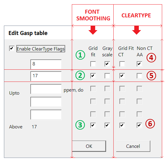
Above, to show an example, is the ‘gasp’ table shown in VTT. (Visual TrueType 6.2, Arial Regular Font)
- To View and Edit the ‘gasp’ table in VTT: Open a Font in VTT > Edit Menu > Edit Gasp Table
- The left two columns control the settings to enable/disable Font Smoothing.
- The right two columns control the settings to enable/disable ClearType symmetric/asymmetric
Note: Enable ClearType Flags, to activate ClearType ‘gasp’ settings
Font Smoothing Settings
1. At 8ppem and below, disable Grid Fit (or Hinting) & enable Grey-scale (Font Smoothing)
2. At 9ppem to 17ppem, enable Grid Fit (or Hinting) & disable Grey-scale (Font Smoothing)
3. Above 17ppem, enable Grid Fit (or Hinting) & enable Grey-scale (Font Smoothing)
ClearType Smoothing Settings
4. At 8ppem and below, disable Grid Fit (or Hinting) & enable Non CT AA (ClearType Symmetric Smoothing)
5. At 9ppem to 17ppem, enable Grid Fit (or Hinting) & disable Non CT AA (ClearType Symmetric Smoothing)
6. Above 17ppem, enable Grid Fit (or Hinting) & enable Non CT AA (ClearType Symmetric Smoothing)
In the next post I will go into more detail on how to best set the ‘gasp’ table, based on the style of font hinting used, as well as proofing and editing the values.
Mike