When I started the development of Proza, I didn’t want to deal with the limitations of a low-resolution rasterizer. As a result, Proza is completely stuffed with diagonal and curved lines, and tiny details that help to bring the texture alive in print, but that are something of a nightmare for a low-resolution rasterizer. As soon as Proza was done, however, I felt the need to make a version that would work well on digital screens, so I simply converted it to a web font, and made my own web test page to see how it would look. It looked as terrible as I expected, so I opened up the font and began editing; hesitantly at first, trying to keep as much of its character alive as possible, but more vigorously with every update. By the time I was done, only the skeleton of Proza remained. The result, Proza Libre, is released on Google Fonts, freely available to use for anybody under an open source license.
When thinking about webfonts, hinting is something that instantly comes to mind. ‘Hints’ are small bites of code instructing a rasterizer which pixels to turn off and on, and is explained in more detail in this Typotheque article. It is essential for any web font that it is hinted, and that it is hinted well. Yet, hinting is not everything, but just one facet of a webfont. In fact, all Macs simply ignore hinting and only rely on the outlines to create pixelated text. This makes for type that is more ‘true’ to the original outlines, but also leads to text that appears darker and a little fuzzier, especially at small sizes. So, when I designed Proza Libre, I knew it wouldn’t suffice to simply add hints. Instead, the outlines themselves would have to be adjusted so that they fit to the pixel-grid more easily. Thus, the first part of Proza Libre’s development was all about the outlines, constantly testing how they rendered on my test pages, through a Mac screen.
Many of the details in the original, when translated to just a few pixels, end up looking fuzzy, thereby losing their added value and decreasing the ‘crispness’ and legibility of the design. So, most changes were focused on making the contours more straight-forward. In doing so, some of the warm qualities of Proza were lost, but the calligraphic feel remained, albeit more cleaner cut. While some changes involved just single glyphs, many were on a fundamental level. In the lowercase, for example, I got rid of the outward curve on the top-left of stems and the diagonal cut on the top. In the uppercase, I got rid of the slight broadening of the stems toward the ends. I made the entire design lighter and spaced it more generously, to prevent the text from looking dark and cramped at smaller sizes. Special attention was given to the white space on the outside of where curves meet stems (indicated with arrows), making them big enough to remain clearly visible, even at small sizes.
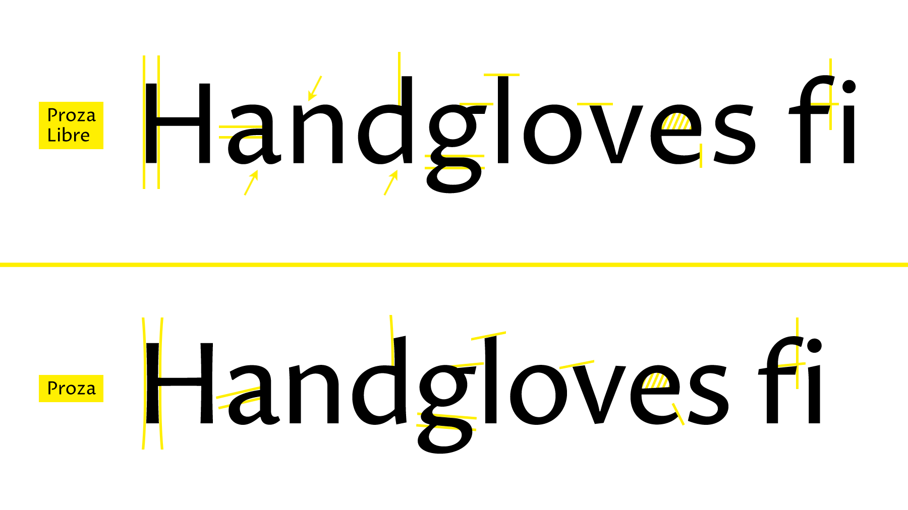
The changes that involved single glyphs or groups of glyphs were often more work, and harder to get right. Some glyphs, like the ‘g’ for example, had to be redesigned from scratch. Many diagonal elements were replaced by horizontal or vertical lines, the most obvious example being the middle part of ‘a’. I cut off the terminals (stroke endings) on the bottom of letters like ‘e’ vertically instead of diagonally, and opened up the counters even more. To prevent ugly collisions when ligatures are turned off (which is often the case on the web), I moved the top of the ‘f’ to the left, allowing it to work better when followed by an i or an l, and straightened the diagonal part of the horizontal bars in f, g, and t. The ‘ear’ of g has a slight indent, to stop it from mingling with the ‘eye’ (circular part) too much, and I redesigned the calligraphic ‘tail’ (bottom part) to a simpler, more horizontal version. The part where the two diagonals of v come together can become very dark at small sizes, so I gave it a broader base to lighten up the joint.

It was only after all this work on the outlines, that I started to look into hinting. I was inexperienced when it comes to hinting, but I knew that manual hinting is a craft of its own that requires a lot of technical knowledge and is very time-consuming. Thus, I looked for other options. At first, I tried outsourcing it, but was put off by the costs, and I disliked the idea of putting somebody else in control of such a vital aspect of my typeface. Fortunately, I stumbled across ttfautohint, a very useful application by Werner Lemberg that automates the hinting process. Of course, automating design decisions is never without its flaws, but ttfautohint permitted me to make manual adjustments to automatically generated hints, and it required far less technical knowledge than purely manual hinting. Since ttfautohint was still in development, there were inevitable bugs. I contacted Werner countless times about potential bugs, half of which turned out to be my own mistake, but he was always willing to help. I would like to think that Proza Libre in that way also aided the development of ttfautohint.

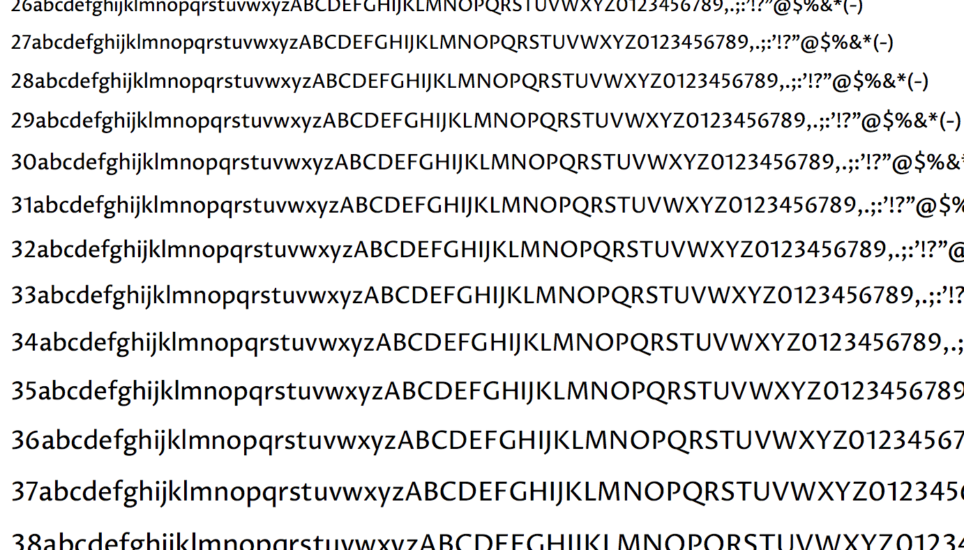
To see how my hinted fonts actually looked across a range of different browsers on different operating systems, and be able to compare results effectively, I made use of a neat web service called Browserstack. The workflow I ended up with, involved generating an auto-hinted font from ttfautohint, converting that to a webfont format, uploading the webfonts to my site’s server, letting Browserstack generate screenshots of a set of pre-selected browser/OS combinations, adjusting the hints manually based on the results, and repeating this process endlessly, until satisfied. I created several test pages aimed at testing specific aspects, one for A-Z, a-z, and basic punctuation, one for all accented glyphs; one for comparing ascender-height and cap-height across weights; and one for checking the spacing, etc. These test pages showed Proza Libre at all sizes from 10 to 53 pixels (ttfautohint wouldn’t let me make adjustments above 53 px), which made some of them very tall, but Browserstack conveniently captures the entire page in a single image.
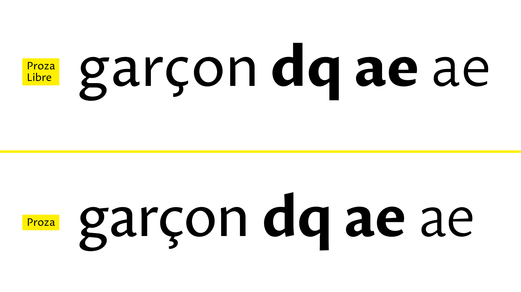
Of course, when I began hinting, I quickly discovered that the better solution was often to go back to the outlines and adjust them even more. The first part of the ‘hinting’ process actually consisted of tweaking the outlines, experimenting with different possibilities, each time checking the results with Browserstack. In humanist typefaces like Proza, the bowls of glyphs like ‘d’ and ‘q’ are usually thicker at the bottom than the top, but this difference can become exaggerated when hinted, because a difference of one entire pixel is often already too much. Thus, I decreased this difference to minimize the amount of manual hinting required. The cedilla turned out to be impossible to get right at small sizes, because it requires too much detail in a very small space, so I redesigned it into a much simpler version (similar to the cedilla in Verdana). In the bolder weights, I decided to keep the middle stroke of e and a the same thickness as in lighter weights, to create more white space on the inside, making sure the ‘eye’ doesn’t get clogged with pixels.
For a type designer like myself, details are an obsession, and a typeface is not done until every single detail is spot on. In that respect, designing a typeface for the web was an especially interesting exercise. A webfont is never perfect, details barely exist, and important design decisions often come down to the lesser of two evils.
Such an exercise may appear unsatisfying, and to some extend it is, but it is also very educational, and the reward comes with lessons learned. Proza Libre is by no means perfect, and I doubt it will ever be, but it is an open source project, so anyone willing and able to contribute or improve it is invited to do so. Proza Libre partially owes its existence to ttfautohint, Browserstack, and support from the Google Fonts project. It comes in 12 styles (6 weights + italics), and is completely free.