Howdy, Stranger!
Categories
- All Categories
- 39 Introductions
- 3.6K Typeface Design
- 764 Font Technology
- 1K Technique and Theory
- 589 Type Business
- 435 Type Design Critiques
- 527 Type Design Software
- 30 Punchcutting
- 132 Lettering and Calligraphy
- 79 Technique and Theory
- 53 Lettering Critiques
- 461 Typography
- 289 History of Typography
- 111 Education
- 61 Resources
- 479 Announcements
- 74 Events
- 104 Job Postings
- 147 Type Releases
- 153 Miscellaneous News
- 259 About TypeDrawers
- 52 TypeDrawers Announcements
- 109 Suggestions and Bug Reports
Options
Brilliance — a glamorous blackletter with small-caps
 Christian Thalmann
Posts: 1,941
Christian Thalmann
Posts: 1,941
Dear TypeDrawers,
here's my latest project, Brilliance. It's based on my calligraphic experimentation with the Pilot Parallel Pens my girlfriend got me for my birthday.
PDF specimen: http://www.cinga.ch/type/Brilliance_specimen.pdf
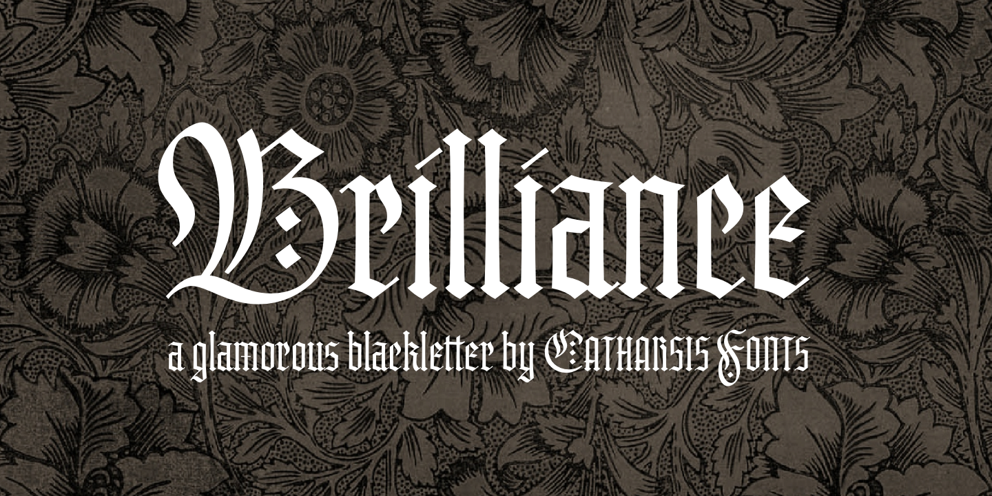
I'd be happy to hear your opinions.
here's my latest project, Brilliance. It's based on my calligraphic experimentation with the Pilot Parallel Pens my girlfriend got me for my birthday.
PDF specimen: http://www.cinga.ch/type/Brilliance_specimen.pdf
I'd be happy to hear your opinions.
2
Comments
thanks for the feedback! I didn't realize my x-height was unusually high for a blackletter. Maybe I should market it as a "humanist blackletter"?
I can see what you mean about the {c}. In fact, it's already raised above the x-height by a few ticks for precisely that reason. I guess I could give it a few ticks more.
As for the tittles, I am offering diamonds as a stylistic alternates, so I got that covered. Personally, I visually prefer the diagonal dashes; they somehow seem a bit more sophisticated to me. But the diamonds certainly work better at small sizes! Good to have both.
Cheers
Edit: Incidentally, I just noticed that \e\x needed a touch of kerning, so I will definitely make another update before publication. I also raised the apex of the \c a tad as suggested by Stephen.
My only concern is the uppercase /G. It's a bit hard to distinguish as a G, and may be mistaken for an /O
@ Frode: I'm sorry to hear that. In what way?
This also means it will not sing at any one size as it is.
Are you suggesting that departing from the restrictions of pen calligraphy and regularizing all thin parts of the glyphs would result in an improved overall impression? I can well imagine that trade-off to be worth it. I can certainly give it a try.
In any case, Brilliance is not published, so I can keep it on hold and as long as necessary until it works.
Admittedly, I didn't expect the need for a structural review of all glyphs, but I can accommodate that.
Personally, I find I have to forge my inspiration while it's hot. If I had to wait years for the gratification of finishing a font, I doubt I'd have the tenacity to do this in the first place. I'm trying my hand at a long-term project with Traction (see that other thread), and often feel daunted at the scale of it all... especially when I see how much effort other people are putting into perfecting their fonts in countless cycles of iteration. So when the inspiration for Brilliance struck recently, I was thankful for the opportunity for a shorter-term intermezzo.
Of course, delaying Brilliance another two weeks or so is a small price to pay if it significantly improves visibly in the process.
Right is new:
But point taken.
I've uploaded the specimen:
http://www.cinga.ch/type/Brilliance_specimen.pdf
Anything else that leaps off the page? Otherwise I might start making another generation of promotional posters... ;o)
Anyway, I think the diagonal slashes on /i and /j are a good idea (traditional, after all), but said slashes seem a bit thin. I also agree with AndreSimardFont that /c and /r could use a bit of tweaking.
I get that the impression of having the answers already that comes from the promotional graphics meant this thread started with a faux pas. And I agree generally that the more decisions that are already made about a design, the less satisfying it is to critique it. But I see feedback of substance here, I see the original designer improving his work, and I see a conversation that is helpful for me as a third party, too. So the idea of pulling the section seems way off base to me.
Maybe you can say more about your perspective and rationale, Frode. Your comments so far here are kind of oblique.
I do apologize for the faux-pas of presenting an almost-final font for critique. Things work a bit differently here than on Typophile, and I'm still adjusting.
@ Andre, Michael: I realize the shapes of /c and /r are more similiar to each other than Antiqua readers are used to — I remember finding that confusing too when I rediscovered blackletter a few months ago. However, I largely followed the example of the grand old Wilhelm Klingspor Schrift and the widely used Old English in those letters... I particularly like the concept of a rightward-pointing foot on the /r, so I wouldn't want to give that up if it's not necessary (though I guess I could shorten it?). I found the swashy upper right terminal a bit awkward at first, but now after the fine-tuning I find it looks pretty sharp.
What changes would you suggest to make these letters more legible while preserving the textura flavor?
EDIT: I just tried out some changes on the /c and /r:
The first row is the previous status quo. In the second row, I've narrowed the /c and reduced the foot of /r. I like the first change, but the second one tears a hole into the closely-woven texture of the font. I think I'm only going to keep the first change (==> third row).
At smaller sizes, the extremely high-waisted R, B are not helping.
I don't accept the "dots" on i and j and useful. I tried.
The "dots" on the i are indeed strange. Two of them would be correct for the umlaut but in the /i I would use something more diamond shaped.
"I think I'm only going to keep the first change (==> third row). "
Good call! That adds just enough difference between /c and /e to aid legibility, while still remaining Textura. As for /r, maybe a longer foot and/or head for more distinction between it and /c? Than again, the more acclimated to this sort of blackface I become, the more I like the consistency between the two.
I tried lowering the waist of the /r and /b in SC, but I didn't like it much. They ended up just a bit lowered, and somewhat reinforced at the waist.
As for the tittles, I've now moved the diamonds to the default positions (they were a stylistic alternate before). I've kept my original thin diagonals as a stylistic alternate, because frankly I really like them at large sizes.