Howdy, Stranger!
Categories
- All Categories
- 39 Introductions
- 3.6K Typeface Design
- 764 Font Technology
- 1K Technique and Theory
- 589 Type Business
- 435 Type Design Critiques
- 527 Type Design Software
- 30 Punchcutting
- 132 Lettering and Calligraphy
- 79 Technique and Theory
- 53 Lettering Critiques
- 461 Typography
- 289 History of Typography
- 111 Education
- 61 Resources
- 479 Announcements
- 74 Events
- 104 Job Postings
- 147 Type Releases
- 153 Miscellaneous News
- 259 About TypeDrawers
- 52 TypeDrawers Announcements
- 109 Suggestions and Bug Reports
New: LeMo V5
 LeMo aka PatternMan aka Frank E Blokland
Posts: 709
LeMo aka PatternMan aka Frank E Blokland
Posts: 709
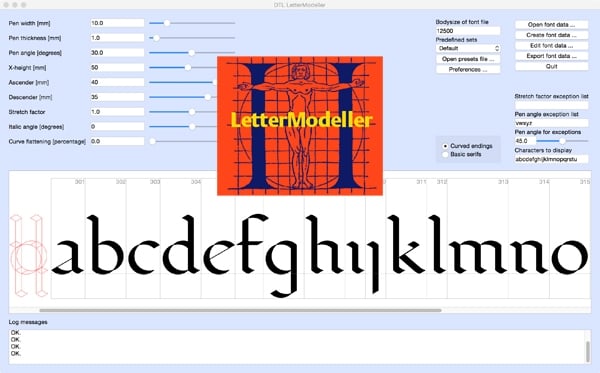
DTL LetterModeller (LeMo) is an application for the exploration and parameterisation of (certain parts of) type-design processes. It is developed by yours truly with the programming help of my longtime (more than 25 years) friends and colleagues at URW++: Dr Jürgen Willrodt, Hartmut Schwarz, and Axel Stoltenberg. The application is the result of my http://www.lettermodel.org/ PhD research at Leiden University on the (effects of) systematisation, standardisation, and unitisation in the Renaissance font production. My research was conducted to test the hypothesis that Gutenberg and his peers developed a standardised and unitised system for the production of textura type and that this system was extrapolated for roman type. Humanistic handwriting was simply moulded into a fixed system already developed for the production of gothic type. Renaissance typographic patterns were partly determined by requirements for the type production. My dissertation, which I successfully defended at Leiden University on the 11th of October 2016, is available as print-on-demand book from Lulu.
The structure LeMo is based on my expertise as Senior Lecturer (calligraphy and type design) at the Royal Academy of Art (KABK) in The Hague since 1987, and as Professor and Research Fellow at the Plantin Institute of Typography in Antwerp since 1995. The models generated with LeMo can be used as a direct basis for type design, or just for generating examples for writing with the broad nib. The new LeMo V5 can be downloaded for free from here.
This new version of LeMo has become a highly flexible and adjustable full-functioning font editor. It contains many nifty features, such as intelligent scaling and stem adjustment. In previous editions of LeMo the glyph editor was restricted to the newly generated glyph database, i.e., as soon as this database was closed it was not possible to edit it anymore but version 5 imports .be files. However, there is a restriction still: currently only one font file can be edited at the time.
LeMo V5 cannot open .ufo files; it will only import .be files. Converting to .be is fairly simple with DTL OTMaster (Light) though: just import an OpenType font in OTM and export it as .be file. The export of .ufo files is a bit different from what most type designers will be used to: for storing the data a folder has to be created and selected from the export dialog. All fontdata has to be stored in this folder and the folder will automatically get the suffix ‘_ufo’. To convert the folder into a .ufo container, the underscore in ‘_ufo’ has to be replaced by a period. I have to admit that this is not ultimately elegant but it works. An improvement in comparison with previous LeMo versions is that for the export of OpenType (CFF and TTF) fonts or .ufo files, a hard-coded default Character Layout (.cha) file is used now. Of course, any other .cha file can be selected too.
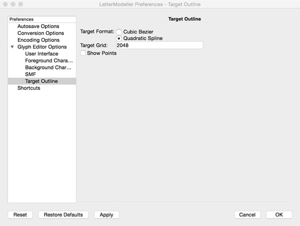
In LeMo V5 cubic splines are converted on the fly to quadratic ones and can be shown in the background, which makes it possible to directly check and control the conversion.

A couple of functions make the design and font-generation process much easier in comparison with previous LeMo versions. For instance the calculation of the bodysize is now based on the values in the main, i.e., first, window. This means that the em-square is always calculated from the distance from the top of the lowercase l to the bottom of the lowercase p. If parameters are altered in the main window, automatically the em-square will be scaled accordingly. The ascender, descender, and x-height values from the main window will appear in the font header. Of course, these calculated values can be altered manually in the font-header dialog.

LeMo V5 preferably requires a large screen and this implies that the display of the many functions is not really optimised for laptops. Hence, when you work with for instance a MacBook it is advised to resize the icons from 36 to 24 pixels to make every function accessible on the screen. Otherwise some ‘save’ and ‘apply’ buttons will be unfortunately out of reach. To make the new icon size effective the program has to be restarted. A three-button mouse will make it much more convenient to place or change contour points and contours (especially in the ‘Quick Mode’) and to position horizontal, vertical, and diagonal guidelines.
Please note that when the glyph editing window is opened for the first time the ‘View’ –> ‘Dock Widgets’, such as the one containing the editing tools, are covering each other. The tabs for controlling the layering will unfortunately not be visible on a laptop screen. To circumvent this limitation, double-clicking on top of the Dock Widgets will make them movable.
Enjoy!
Comments
The more expensive version of my dissertation distributed by Lulu is actually identical to the cheaper one. Lulu calculates a minimum price based on the production costs. Eventually this version will become also available via Amazon and other distributors. I would buy the cheaper one if I were you.
In this skeleton font all characters are defined as outlines.
When I load your skeleton-2.ik most of the parameter sliders like ascender and descenders stop working as intended. Also the radio button which changes the serifs has not effect on the serif anymore.
No worries. It is handsome volume. I and looking forward to reading it.
I hope you enjoy reading the book, as learn a bit from it as well. The production costs of the color edition is relatively high, and hence is the book’s price. Although I have to honestly admit here that I receive a whopping €1.63 from Lulu per sold copy.
BTW, For students we discounted the price of the B/W edition of On the Origin of Patterning in Movable Latin Type to €10, which is far less than production costs.
Best, Frank
Since a couple of months the B/W print-on-demand edition of my dissertation is for sale at the bookshop of the Museum Plantin-Moretus. The book is selling well and the museum ordered new stock yesterday. Before you know, it will become a bestseller.
LeMo 5.4 contains a text editor (for preview and editing of widths) now, besides antialiasing in the glyph editor, enhanced functionality of the drawing tools, and an improved interface of the editor for small screens (read: laptops).
LeMo The Video Trailer
LeMo The Video
LeMo The Tool
(for macOS only currently; Windows and Linux editions will become available shortly).
Shortly the University of Split will publish a book by Nikola Djurek and yours truly. It combines elements of my calligraphy course book from 1990 with my research into the origins of the harmonics, patterns and dynamics in movable Latin type, with Nikola’s PhD dissertation on the history and conventions for Croatian diacritics, and with his recent research on the history of Croatian scripts (Glagolitic, Cyrillic, Latin). Of course, it contains information about the LeMo model.
The book, which was designed by Nikola, is especially meant for the students of the University of Split and the texts are in Croatian. However, already I received requests for an English translation, so this might be something to consider if there is enough interest for it.