Howdy, Stranger!
Categories
- All Categories
- 39 Introductions
- 3.6K Typeface Design
- 764 Font Technology
- 1K Technique and Theory
- 589 Type Business
- 435 Type Design Critiques
- 527 Type Design Software
- 30 Punchcutting
- 132 Lettering and Calligraphy
- 79 Technique and Theory
- 53 Lettering Critiques
- 461 Typography
- 289 History of Typography
- 111 Education
- 61 Resources
- 479 Announcements
- 74 Events
- 104 Job Postings
- 147 Type Releases
- 153 Miscellaneous News
- 259 About TypeDrawers
- 52 TypeDrawers Announcements
- 109 Suggestions and Bug Reports
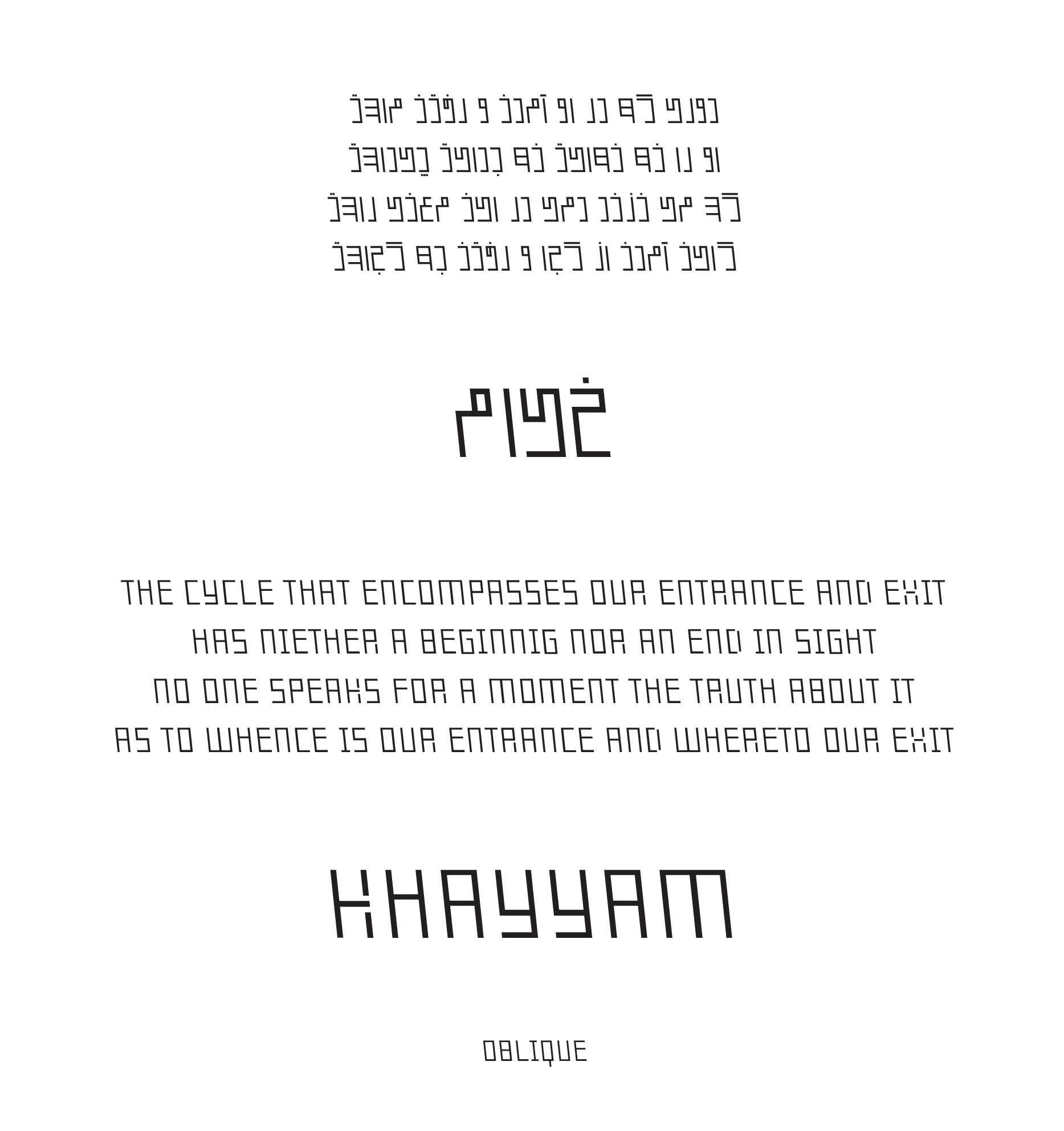
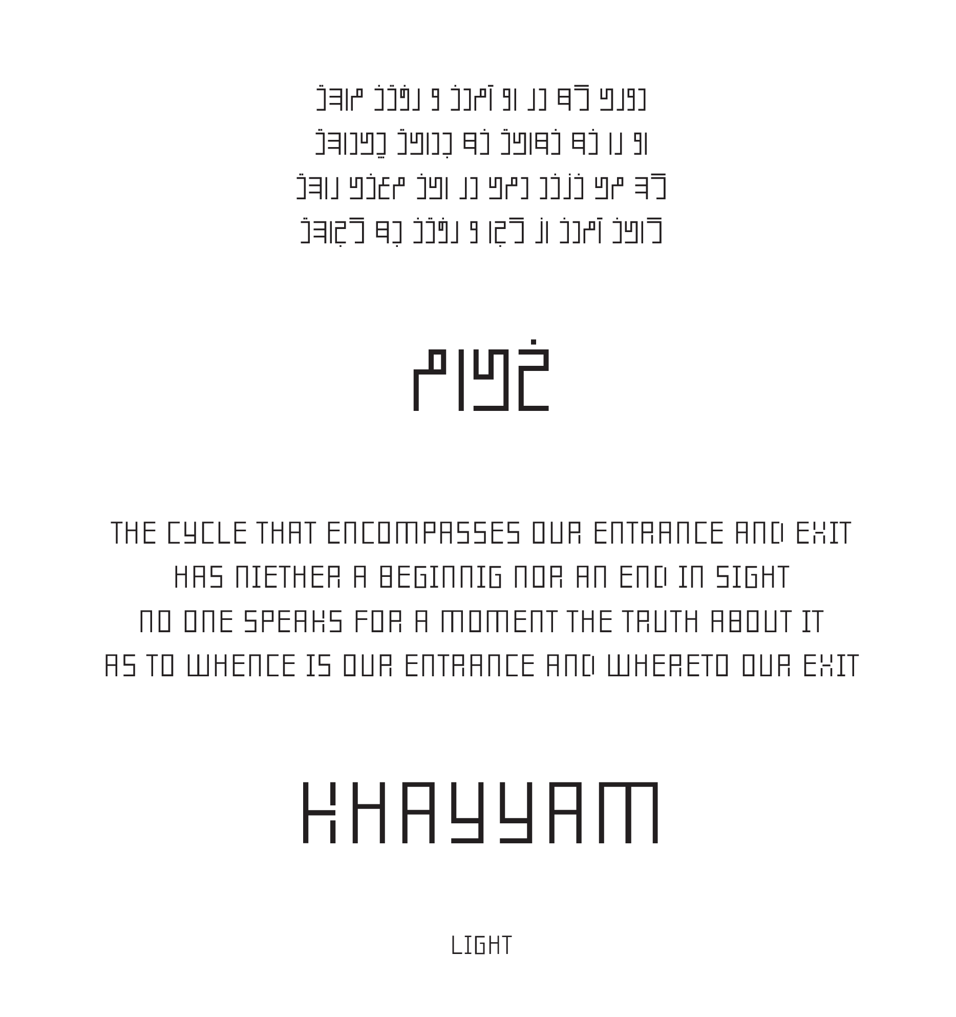
Persian (Arabic) typeface that works as a new alphabet!
 Shahab Siavash
Posts: 141
Shahab Siavash
Posts: 141
Hello,
First, I want to mention that I am a graphic designer and typographer. I was writing articles and books in the past few years about graphic and type design. Been awarded as a critic and have had several exhibitions in Iran and other countries. I’m usually into designing new modern Persian fonts, you may call them “fantasy” or “display” or… The name is not important. My well-known typeface was the first Persian grunge typeface (2005) which was featured on Behance in 2009 and has been published in several books and websites.
But today I’m going to talk about this (the attachments) typeface and why & how I designed it.
We have all seen the very big difference between Latin and Persian alphabets. One has vertical, almost isometric, mono-spaced letters and the other one has ups and downs on and off the baseline, also different weights and widths are another issue. When we use these two alphabets in a design, letters doesn’t match. But we accept that, because there was no other choice.
So, years ago, I decided to do something about this and I realised that I should change the Persian alphabet in a modern typographic way. I did these things:
1- Removed the connection between the letters. [All Persian (Arabic) letters are connected to each other unlike the Latin letters.] To do this I made the letters vertical oriented and separated from each other.
2- Once you decide to accomplish number 1, you realise that you should design the letters from scratch. So I did. Every single letter in this Persian alphabet is redesigned to fit this idea. But all of them are inspired by the original letters. Any Persian (Arabic) parson can read them. This is a typographic approach to design a modern Persian typeface.
3- After doing all of that, now there is no need to have 4 (or 2) forms for each letter. (Initial, medial, final and isolated glyphs) Therefore, this font performs like a Latin typeface and shows one form for each letter.
4- I also wanted to do this in an isometric and mono-spaced style. There are no angles except 90 degrees. I too, changed some of the Latin letters to reach this goal. (I want to mention that this is a new style to design Persian fonts and can be improved or changed through time by others in different ways.)
5- And to complete the fantasy, the typeface comes with 10 different weights! It enables the user to have a good experience with the typeface. The weights are: (See the attachments, some of the weights still need work to be completed.)
I. Light II. Italic (For LTR) III. Oblique (For RTL) IV. Outline V. Round VI. Smooth VII. Bold IIX. Black IX. Perspective X. Distorted
Persian (Arabic) typefaces are very poor when it comes to fantasy or display ones. I'd be glad if you share your comments with me.
Thanks for reading this,
Shahab Siavash


Comments
I don't see any reason not to develop new writing systems and think it could be useful in many and refreshing ways.
There might no be a need to restrict yourself to isometrics and mono-spacing, the new vertical formation and detachment of the letters are the main issue, preserving the flexibility given by curves and angels you can achieve better results, both of legibility and typography.
Just an idea about your /K : why not dooing like for the /X (see attached picture). Could be more legible.
About the Persian part, would you agree that both Latin and Persian are matched or not?
I mean I want to know that the Persian part gives non-Persian people a western vibe?
So I decided to begin with this because this "kind of formation of the letters" is somehow more familiar for a native Persian or Arab.
https://en.wikipedia.org/wiki/Bannai_script
P.S: About the grunge font, thanks again
Hello! I changed the K and the R. Please tell me what do you think?
There have been some big changes:
- Distorted and Perspective styles were removed.
- Inline (which is my favourite!) and PurePersian were added instead.
- Kernings and metrics for all styles were set.
- The name of the typeface was created: KayKhosrow!
- Bold Italic and Black Italic were added.
- Stylistic Alternates was added to 2 styles. (Thanks to @Kent Lew)
- Glyphs like /K /X /R were redesigned. (Thanks to @Simon Cozens @Ray Larabie @Ofir Shavit @ivan louette)
- Ligatures in Persian like Lam+Alef and Lam+Lam+Heh were removed. (There is no need for them because the glyphs are not attached together, here.)
- A color font* version was added based on the Inline style.
* I like to do the first one things and this is actually the first ever Persian color font
Enough of the talking, let's see some glyphs