Howdy, Stranger!
Categories
- All Categories
- 39 Introductions
- 3.6K Typeface Design
- 764 Font Technology
- 1K Technique and Theory
- 587 Type Business
- 435 Type Design Critiques
- 526 Type Design Software
- 30 Punchcutting
- 132 Lettering and Calligraphy
- 79 Technique and Theory
- 53 Lettering Critiques
- 461 Typography
- 289 History of Typography
- 111 Education
- 61 Resources
- 479 Announcements
- 74 Events
- 104 Job Postings
- 147 Type Releases
- 153 Miscellaneous News
- 259 About TypeDrawers
- 52 TypeDrawers Announcements
- 109 Suggestions and Bug Reports
Options
Eurabic
 LeMo aka PatternMan aka Frank E Blokland
Posts: 709
At the ATypI Reykjavik conference in 2011 Thomas Milo gave talk on ‘The role of Dutch Arabic Typography in Middle Eastern Printing’. It was there that I heard him using the term ‘Eurabic’ for Arabic type that was made –especially for scholarly purposes– in Western Europe. By now most of you are familiar with my preoccupation with the standardization and systematization of the Renaissance font production. Earlier this year I asked a talented KABK LetterStudio student from Iran, Sabert Javanmard, whether he would be interested in (making a start with) investigating the standardization and systematization of Renaissance Eurabic in the context of one of the modules that I offer the students. And Saber was and is indeed interested.

Some time ago at the Mueum Plantin-Moretus I took a photo of one of the Le Bé fragments collected by Max Rooses, who was the first curator of the museum, and inserted by him in what is documented as Volume 153. The Arabic type in question has been attributed to Le Bé, but it is not sure whether he cut it himself. In any case: the type is a faithful copy of one of the Eurabics that Granjon cut in Rome between 1583 and 1586.

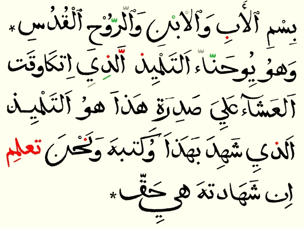
First of all Sabert checked the texts and consulted some experts. This resulted in the mapping of the mistakes in the image above: the text on top is from the specimen and below as it should be.

The design by Le Bé / Granjon shows a strange mix of Arabic scripts like Naskh, Thuluth, and Muhaqqaq. There are different forms of the characters, proportions and grammatical and linguistic mistakes.

For instance the image above shows the missing words, dots, the wrong words and incorrect diacritics.

And this image shows the different scripts that can be traced.
More to come!

Some time ago at the Mueum Plantin-Moretus I took a photo of one of the Le Bé fragments collected by Max Rooses, who was the first curator of the museum, and inserted by him in what is documented as Volume 153. The Arabic type in question has been attributed to Le Bé, but it is not sure whether he cut it himself. In any case: the type is a faithful copy of one of the Eurabics that Granjon cut in Rome between 1583 and 1586.

First of all Sabert checked the texts and consulted some experts. This resulted in the mapping of the mistakes in the image above: the text on top is from the specimen and below as it should be.

The design by Le Bé / Granjon shows a strange mix of Arabic scripts like Naskh, Thuluth, and Muhaqqaq. There are different forms of the characters, proportions and grammatical and linguistic mistakes.

For instance the image above shows the missing words, dots, the wrong words and incorrect diacritics.

And this image shows the different scripts that can be traced.
More to come!
4
Comments
Interesting post, Frank. This specimen was produced by Guillaume Le Bé II, the son, and it may well be Granjon's Arabic, as Le Bé I makes no mention of an Arabic type in his own specimen/log book.
Assuming it is the large Granjon Arabic, I wonder if a full specimen of this type couldn't be assembled from other printed works in which it appeared, such as the Evangelium Sanctum Domini Nostri Jesu Christi, published by the Typographia Medicea, in Rome, 1590. I believe Granjon cut three Arabics while in Rome. Huda Smitshuijzen Abi-Fares write about them in her book Arabic Typography: A Comprehensive Sourcebook, as did Wayne Osborn, in a 2008 UC San Diego dissertation, "The Type of Calligraphy: Writing, Print, and Technologies of the Arabic Alphabet," which is free to download.
Could it have that Le Bé II purposely used multiple forms incorrectly to show the range of characters in a small space? There's a specimen (which I can't find at the moment) of Granjon's Syriac in which the two different scripts are set together, something that would only happen in a demo.
After I posted a link to this topic on my Facebook account a couple of days ago, Thomas Milo pointed me at a highly interesting article he wrote on Bodoni’s Arabic. In his summery at the end of the article Thomas writes; ‘If Bodoni had fully understood this description, he would not have continued the tradition of mixing thuluth and naskh elements. It is clear that he directly or indirectly copied Granjon’s types […].’ This indicates that the mixing was deeply rooted in Eurabic.
That would be the next step for Sabert then. I think that the compactness of the print in question makes the start of such a research a bit easier.
What interests me most, is whether there is a systematization/unitization in the Renaissance non-Latin scripts and if so: what was the effect on the proportions and details of the characters? The fact that –as you write– Granjon mixed different Syriac scripts points in the direction of such a standardization.
http://www.compulsivebodoni.com/?portfolio=thomas-milo-bodonis-arabic-some-observations