Howdy, Stranger!
Categories
- All Categories
- 39 Introductions
- 3.6K Typeface Design
- 764 Font Technology
- 1K Technique and Theory
- 588 Type Business
- 435 Type Design Critiques
- 526 Type Design Software
- 30 Punchcutting
- 132 Lettering and Calligraphy
- 79 Technique and Theory
- 53 Lettering Critiques
- 461 Typography
- 289 History of Typography
- 111 Education
- 61 Resources
- 479 Announcements
- 74 Events
- 104 Job Postings
- 147 Type Releases
- 153 Miscellaneous News
- 259 About TypeDrawers
- 52 TypeDrawers Announcements
- 109 Suggestions and Bug Reports
Options
Looking for critique on my Canberra typeface entry
 Chris D
Posts: 76
Chris D
Posts: 76
Hey people,
First time poster, long time lurker.
Now the Canberra Typeface comp is over and all of the entries are out in the open, I'm looking for some suggestions / advice on the typeface entry I designed for this. I haven't built a full alphabet set like this before, but I have always had a keen interest in type design / typography and have only just ventured into the actual production of fonts. I think getting a copy of Karen Cheng's "Designing Type" really got me motivated with exploring type design! I'm also a graphic designer by trade, having run my own studio for a few years now in Adelaide, South Australia.
I designed this entry in 10 days using Glyphs (I only found out about the competition until very late in the process!) It's main inspiration is drawn from the 20's & 30's art deco era, around the time when Canberra was planned and built, and it also has a few natural shapes & letterforms that draw upon the scenic / natural bush landscape that Canberra it was situated in. I'm particularly proud of the lowercase /a/ shape that communicates this - the spur at the bottom has a nice bulbous ending like a twig would!
After the competition, I wasn't really sure about what my plans are next with this, whether to shelve it or extend it with more weights, alternate styles etc. But now I feel like doing something more with it - I am thinking of redrawing alot of the letters so I'd like your opinion on what you think needs the most improvement. I'm not precious so please be honest!
PDF type sample: http://www.canberra.edu.au/typeface/gallery-folder/3239.pdf
And here's a screencap:
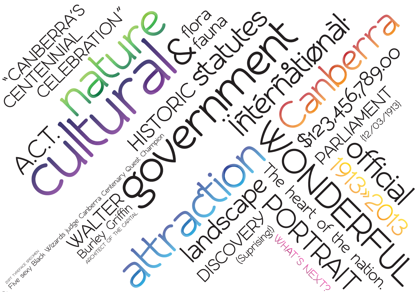
It also has no name yet (Other than "Canberra Type Entry" :P ) so if you have any thoughts on that, that would be cool too")
Thanks everyone, great forum here.
First time poster, long time lurker.
Now the Canberra Typeface comp is over and all of the entries are out in the open, I'm looking for some suggestions / advice on the typeface entry I designed for this. I haven't built a full alphabet set like this before, but I have always had a keen interest in type design / typography and have only just ventured into the actual production of fonts. I think getting a copy of Karen Cheng's "Designing Type" really got me motivated with exploring type design! I'm also a graphic designer by trade, having run my own studio for a few years now in Adelaide, South Australia.
I designed this entry in 10 days using Glyphs (I only found out about the competition until very late in the process!) It's main inspiration is drawn from the 20's & 30's art deco era, around the time when Canberra was planned and built, and it also has a few natural shapes & letterforms that draw upon the scenic / natural bush landscape that Canberra it was situated in. I'm particularly proud of the lowercase /a/ shape that communicates this - the spur at the bottom has a nice bulbous ending like a twig would!
After the competition, I wasn't really sure about what my plans are next with this, whether to shelve it or extend it with more weights, alternate styles etc. But now I feel like doing something more with it - I am thinking of redrawing alot of the letters so I'd like your opinion on what you think needs the most improvement. I'm not precious so please be honest!
PDF type sample: http://www.canberra.edu.au/typeface/gallery-folder/3239.pdf
And here's a screencap:
It also has no name yet (Other than "Canberra Type Entry" :P ) so if you have any thoughts on that, that would be cool too
Thanks everyone, great forum here.
0
Comments
To "appear" monoline (assuming that is the intent—yes?), horizontals need to be a smidge thinner than verticals. Looking for example at the bottom of the "u" compared to the vertical stems. Bottom of the "c" is heavier than the side, and the top. (I think—possible the gradient is fooling me.
Curves that join in to straight strokes need some thinning at and near the join to avoid a clogged appearance. See: abdhmnpr. Look at how pro-grade sans serifs handle this.
Anyhow, a fine first try at a typeface! Welcome to the great addiction of our lives.
Thank you very much for your input & your welcome - you are correct in that I intended this to be monoline, with no contrast as such. I agree with your points about introducing some tapers where curves meet straights - I'll definitely keep working at it!