TypeDrawers
Discussions
Activity
Best Of...
Sign In
Home
›
Type Design Critiques
Sign In
·
Register
Howdy, Stranger!
It looks like you're new here. If you want to get involved, click one of these buttons!
Sign In
Register
Quick Links
Categories
Recent Discussions
Activity
Best Of...
Categories
2.7K
All Categories
2
Introductions
2.2K
Typeface Design
293
Font Technology
754
Technique and Theory
291
Type Business
279
Type Design Critiques
396
Type Design Software
27
Punchcutting
57
Lettering and Calligraphy
35
Technique and Theory
22
Lettering Critiques
210
Typography
145
History of Typography
65
Education
324
Announcements
56
Events
60
Job Postings
96
Type Releases
111
Miscellaneous News
165
About TypeDrawers
41
TypeDrawers Announcements
72
Suggestions and Bug Reports
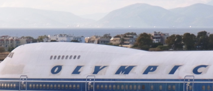
An aerographic detail
Andreas Stötzner
Posts:
335
January 2017
in
Type Design Critiques
I don’t know if anyone noticed it earlier, I did only recently. Those bits –
serifs? aerifs??
– change their position dependent on the
air flow
direction.
Funny idea, actually.
oly-1.jpg
55.4K
oly-2.jpg
65.9K
6
Comments
Hrant H. Papazian
Posts:
1,187
January 2017
Pan Am used to do that too.
https://twitter.com/hhpapazian/status/804414176240091136
2
Mark Simonson
Posts:
1,018
January 2017
Not quite the same, but reminds me of
TFAvian
.
1
Sign In
or
Register
to comment.
Forum Software Powered by Vanilla
Comments