'Modernist' solutions for the ogonek

Wei Huang
Posts: 99

Curious to know what are some acceptable designs to readers of -ogonek glyphs:
I.e. are these even ok:


Tagged:
2
Comments
-
You’ve included various things in your images. There is no C or S with ogonek. These are glyphs for Ç窺 (or Șș), i.e. no ogoneks, but cedilla or comma accents.
Yes, Albert-Jan Pool went for modernist accents in his FF DIN, with ogonek, cedilla and comma accent sharing a common simplified form. Note that this font family also includes an alternate form – an equally detached half circle, open on the left in comma/cedilla, open on the right in ogonek. It can be argued that these are reasonable shapes for a typeface derived from engineers’ lettering, and similar reductionist solutions can be found in period lettering. I leave it to native users to comment on the acceptability for contemporary use.
The ogonek in Plain certainly is problematic: It exceeds the right boundary of the base glyph. Not only does this make “the letter loose its natural harmony and balance and thus ‘flip’ to the right.” (Adam Twardoch). It also may cause spacing issues for pairs like ąj įj ųj as used in Lithuanian.
4 -
Thanks for the Flickr link! I included Ccedilla and Scommaccent to show how the cedilla, commaccent and ogonek were conflated in those fonts.
For reference, Albert-Jan Pool's alternates:
1 -
This kind of ogonek also pops up in the slightly curious Nimbus Sans Diagonal (with a different cedilla shape compared to Nimbus Sans Black, too):


Polish traffic signs also feature an unconventional ogonek:
There are also a few pictures on flickr that show simple, straight ogoneks in various forms (connected, disconnecet, left leaning, right leaning, handwritten, and in print).
I wonder if such a «modernist» ogonek would be appropriate for Navajo if centered on the glyph? The Navajo version of Verdana for example has a relatively plain ogonek.0 -
I speak for polish ogonek. It is not an accent, it should be considered as a part of a glyph. It cannot be separated. Please, look at the article of Adam Twardoch. It is a great reference.
Ogonek from polish traffic signs is terrible. It was not made by a font designer.3 -
-
@Michał Jarociński
I've seen the Twardoch reference. He doesn't touch on modernist designs, or non-traditional ones.
So you do not accept the alternate in Din?:
0 -
main problem is that a lower bowl of "a" connecting a stem leaves no space for correctly drawn ogonek. Drawing ogonek, as it is suggested in Adam's article, could make terrible congestion in that area, so designers try to resolve this in a different way. It is not quite correct, but it is readable.
Personally, I would rather try to modify a base glyph to avoid congestion, then make ogonek looks awkward.
This is how I do it: 3
3 -
From looking at Polish signs and logos, it seems like the disconnected ogonek is a rare case. I've only done it in stencil fonts and a few weird sci-fi fonts. But even then, it shouldn't look like a comma or cedilla. There should be more emphasis on the horizontal hook, not the vertical part. As @Michał Jarociński said: it is not an accent...
When you have a congestion problem with the ogonek on the lowercase a and you're not willing to compromise the base glyph you can create more space by flattening the top left curve and making it thinner. The important thing is that the bottom of the ogonek is substantial and relates to the letters.
If you're dealing with heavy squarish forms like a heavy Microgramma, that part of the lowercase a can easily get congested. Instead of attempting a curve, try more of an inverted 7 type of idea. That way there's room to give the bottom of the ogonek some weight while giving the top part room to breathe. I've seen this effect on hand painted Polish signs and I think it's a good solution for techno-ish situations where you need to give the ogonek some breathing space while still giving it some heft.
1 -
It would be nice if some Polish designers would get together and write a piece about good, recognizable modern ogoneks. I think that one reason so many people still get them wrong is that there’s plenty of conservative advice for drawing traditional ogoneks, but not much about what’s good/bad/wrong outside serif type. Obviously this thread is a step in that direction, but most of it still isn’t being written by Poles.1
-
For sure. Taking bold chances with accents or other language specific characters requires a lot of research. When you travel the world, you see so much creative use of accents. I think, to be able to take calculated risks, it's important to know which accents need to be discernible. For example: as far as I know, there's no language that requires readers to differentiate between a macron and a tilde. If a wavy tilde seems out of place in a square, sci-fi typeface, you can make it flat. Are there any languages that require readers to differentiate between comma accents and cedillas? I couldn't find one. I think it's safe to use a single shape to represent both. At least, I hope so.
But when you look this stuff up you read things such as: Portuguese readers hate straight or comma cedillas but French people are okay with them. And then you see Brazilian hand written signs where they draw a straight cedilla. Sure, maybe highbrow typographers hate straight straight cedillas but what about poster designers or sign makers? Do people really have trouble reading straight cedillas? Does it look stupid when people put traditional cedillas on techno fonts?
0 -
Simplified cedillas in Brazil
(1) they are always read as cedillas because we have no other diacritic bellow letters;
(2) they are not hated at all, but seem as stylish or informal in fonts;
(3) they are usual in handwritten script, but kids learn to write them correctly in school.
This liberty with cedilla is not a choice but a result of a country with poor educational level. Similarly, you can find acute and tilde written as a straight line. People use not to pay much attention to this kind of detail, even in educated communication. But this is a low level criteria as here you can find many formal documents made with Comic Sans and large academic books entirely using Arial.
My general suggestion is to keep cedilla linked to base letter and, except if the font has an unusual design, to preserve original form. This would satisfy all users, no matter if they are in Brazil, Portugal, France or Marshall Islands.
Macron and tilde
I would always use distinct forms to macron and tilde. Words or fragments in Latin are common in Law, Medicine, Natural History and Linguistics. Although optional, Macron is used to mark the strongest syllable in Latin and would cause confusion with tilde. Macron is also used in transliteration from Indic languages.3 -
I remember seeing Livonian but since there were no living speakers I disregarded it in the context of display typefaces. Either way, the more information we have, the better we can make decisions. For example: if I'm making a sci-fi display font, and the only uses that require a wavy tilde are academic or deprecated languages, I can make an informed decision about whether to flatten it or not or make OpenType rules for it.
1 -
This is an old thread, and a recurrent problem. I recently received a request to include in my fonts some glyphs with ogonek and acute for Old Norse. The user also pointed out that the position of ogonek on O should be centred. I usually designed them to be right aligned.
After reading this thread, and others about the design and positioning of the ogonek, I redesigned my glyphs for Verajja as below:
- I aligned the ogonek to the right for E,
- Right of centre for O and U,
- Joining to align with the left of the stem for A and I
- Accents for Small Capitals are reduced to 90%
- Accents for Petite Capitals are reduced to 80%
0 -
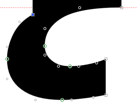
Some of those intersections are jarring. I don't shy away from modifying the base letterform; in fact I tend to use things like the ogonek as an excuse to do that...0
-
I ❤️ ogoneks.0
-
It gets worse with the bold. Attaching the ogonek to the left of the stem of the A or I makes for a jarring connection. Modifying the base glyph makes the ogonek too bold. Moving the ogonek to the right of the stem makes it stick out like a sore thumb and clash with descenders on adjacent letters like j, p, or y.Hrant H. Papazian said:Some of those intersections are jarring.
How is it if I modify A and I ogonek like this, extending the base glyph stems down a bit, and make a smooth join to the ogonek?
I") ogoneks. They make such a lot of work. 2
ogoneks. They make such a lot of work. 2 -
This is my current version of Verajja Bold with the modified Ogonek glyphs. I have smoothed the transition between the ogonek and the base glyph for all glyphs.

2 -
Your attachments are much better in this version.
I'm inclined to think you could still go a bit bolder in the ogonek, given the weight of the main glyphs. It's an enjoyable challenge.") 1
1 -
If you angle the top of the ogonek and make the sharp bit further to the right there are a few construction advantages: on straight shapes like AEI, you can place the top right vector of the ogonek directly on top of the bottom right vector of the letter. Nice and tidy. In the case of I, you can blend the left side of the stem but I find this doesn't look so good on very heavier weights. In the case of round letters like OUe, the low angle of incidence doesn't create much of a kink where it attaches to the bowl. If you want to smooth out the kink, less vector surgery is required. By designing the ogonek to connect in the corner it avoids a sort of concave look....I'm not sure now to explain. See how your A connects to the ogonek? The bottom looks kind of scooped out. Maybe that's not a bad thing but I try to avoid it. I like the ogonek to start off more diagonally than curved.
One disadvantage of using this type of ogonek is that it can create an extremely acute angle in the negative space where it connects. That might require a snip to square off the sharp angle.
Sometimes I'll make the bottom of the ogonek flush with the top. But it really depends on the design of the t and c; there should be some relationship with those shapes. I'll usually modify the ogonek after spacing tests to make sure it looks good in context.
1 -
> I have smoothed the transition between the ogonek and the base glyph for all glyphs.
Much nicer!
1 -
Thanks for the feedback. I have made the ogonek a bit bolder on the bold and bold italic type styles.
I have updated my Verajja Font with the improvements. Maybe more later, but that's good enough for now. My other fonts need the same treatment.0 -
One thing that bothers me visually is when in Iogonek or iogonek the ogonek exits the stem in a centered fashion but is not as wide as the stem. Is there a convention on that case and what is acceptable and what is good form?0
-
Arial Bold does it like that, and it does not even merge the composite glyph members into one contour. So, it's apparently acceptable to Microsoft, but I guess that's why those of us who are a bit more particular create our own fonts.
I think my example in my post of February 3rd is acceptable, but I agree with others that it can be better, so I spent a few days fixing some of my fonts.
I have updated Acariya, Balava, and Guru. Maybe I will fix them all in time.0 -
Also, Arial was made ~25 years ago, and standards of craftsmanship for diacritics have advanced considerably since then. Without even looking, I'll bet you could find much nicer in the ClearType fonts, for example—acceptable to Microsoft more recently.2
-
Like fingers crossed for nobody to emulate the Armenian in Arial Unicode jeezus.
1 -
I thought it might help to share how I reconstructed the Ogonek with Bold Italic Capital U in my Pali font using FontCreator 10.1. The yellow outline is copied from the original contour and used as a background image. The diagonal guide is set at the italic angle of the font (12°) and dragged to align right with the italic U contour. Complete Composites will position the Ogonek to align right, but it needs adjusting for italic glyphs, hence the guide for precise positioning.
After joining the contours with "Get Union of Contours," one on-point node where the ogonek joins the U needs to be converted to an off-curve node, then moved down a few funits to avoid an off-curve extreme (in this case, though not usually). The next off-curve node then needs adjusting to get a smooth curve
1


Categories
- All Categories
- 46 Introductions
- 3.9K Typeface Design
- 485 Type Design Critiques
- 560 Type Design Software
- 1.1K Type Design Technique & Theory
- 654 Type Business
- 853 Font Technology
- 29 Punchcutting
- 519 Typography
- 119 Type Education
- 323 Type History
- 77 Type Resources
- 112 Lettering and Calligraphy
- 33 Lettering Critiques
- 79 Lettering Technique & Theory
- 550 Announcements
- 91 Events
- 114 Job Postings
- 170 Type Releases
- 174 Miscellaneous News
- 276 About TypeDrawers
- 54 TypeDrawers Announcements
- 120 Suggestions and Bug Reports